Bernard
Celebrating its 75th anniversary in 2022, Bernard, a MIG (metal inert gas) welding innovator, has a significant legacy, and it was ready to step into the modern era with a brand refresh.
Under the Illinois Tool Works (ITW) umbrella of brands, Bernard and Tregakiss combine their proven experience and storied legacies to manufacture top-quality welding solutions. With a legacy rooted in craftsmanship and innovation, Bernard recognized the need to evolve visually. A refreshed identity would help signal its continued relevance in a changing industry.
Bernard needed an identity refresh to modernize it alongside ITW’s other portfolio companies while retaining the spirit of its previous branding.

Brand Evaluation
We identified their Single Most Important Thing (aka SMIT) as “A Modern Legacy”: bringing a storied brand into a new era of growth and innovation.
As a brand “refresh,” the Bernard team knew there was a lot of their previous identity they wanted to maintain. The gold palette was a helpful differentiator in their industry and the spark element felt right but lacked refinement. However, their identity did need a more robust visual identity that could help Bernard establish more unified visuals, from digital presence to physical products.
In exploring how to best modernize the Bernard lockup while retaining its heritage, we identified two key areas to improve. The spark mark had too many small points that got lost at smaller scales, and the horizontal line through the wordmark left awkward remnants of a few letters (such as the middle crossbar of the E).

Logo
In order to bring a cutting-edge touch to the identity, we explored a number of sans serif logotype options that evoke feelings of strength, modernity, and industry. The wide-set letterforms project strength, while the rounded counters feel familiar and moderate amongst a sea of overly-strong competitor brands.
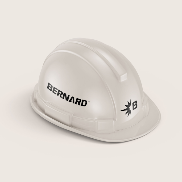
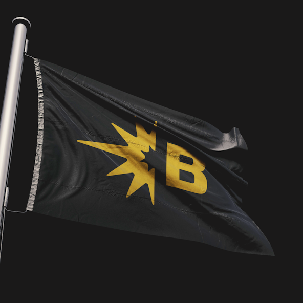
We refined the spark to be readable at a small size and add some energy to the system. By separating the spark from the B, we created three distinct logo options: a logomark, a logotype, and a lockup.



Visual Language
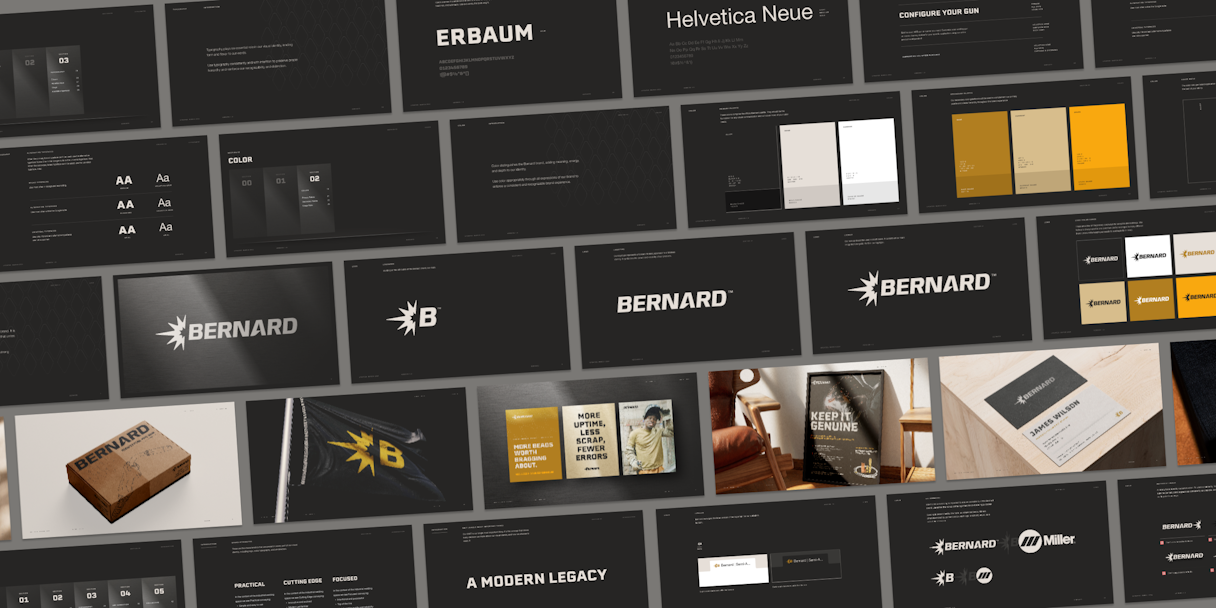
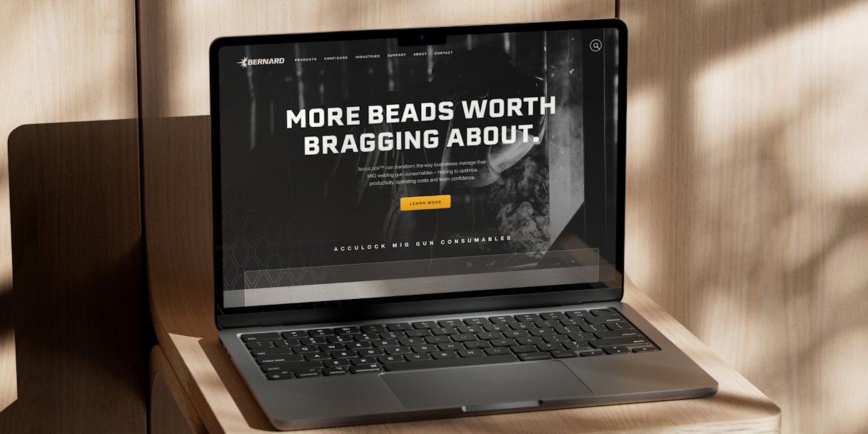
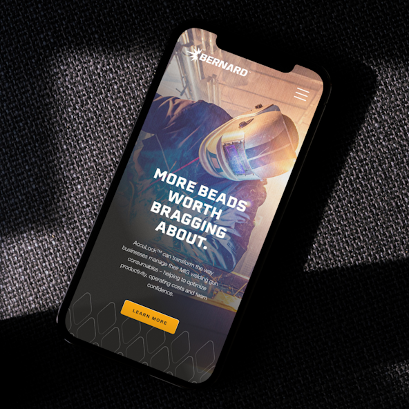
To continue with the consistent theme of structure and strength, we wanted a similarly mighty typeface to play the role of the primary. Erbaum is a sort of “slab sans serif” that leans heavily into industrial overtones. Leveraging the typeface in all caps gives a very strong, sturdy, and industrial look to the type system.
Helvetica Neue is Bernard’s secondary typeface. It exudes a sense of professionalism and reliability. Its clean, geometric lines convey a modern yet timeless aesthetic.
While there are years of equity in the existing Bernard color palette, we wanted to slightly simplify and add an additional value into the fold. Alloy, Bond, Carbide, Current, and Base are all current Bernard colors, but there was a desire to see a jolt of vibrancy and value in the identity — and that’s where Spark comes in. The feeling of a specific composition can change based on certain color combinations, providing great flexibility. For example, the combination of Spark and Alloy creates an intense and modern impression, whereas Bond and Base together are more modern and timeless.
To build out the visual identity further, we included two textures to enhance compositions: Alloy and Grip. Rather than take an overly aggressive approach with scuffed and scratched metal, the Alloy texture showcases the industrial landscape of Bernard while still being clean, approachable, and precise. The Grip texture – made up of the repeating diamonds seen on industrial grips – is a natural way to incorporate Bernard’s products into the visual language.




Brand Support
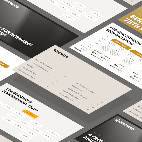
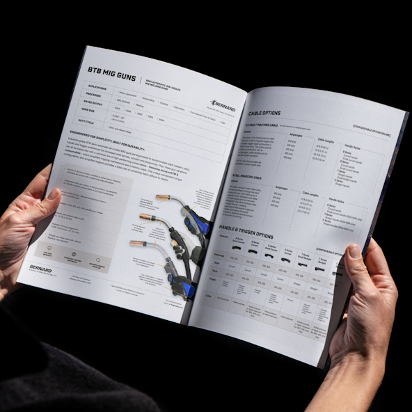
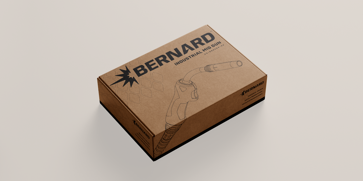
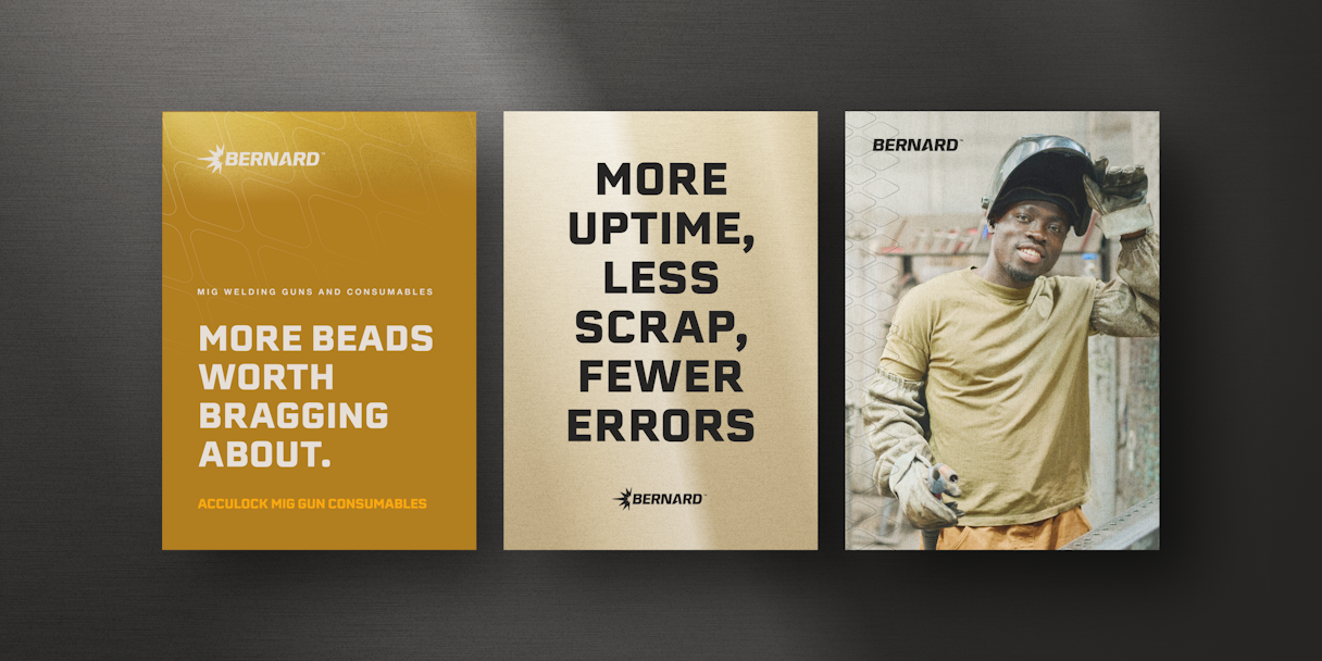
There are a lot of moving pieces to a brand rollout, but luckily our retainer team is made up of rollout experts. We worked with Bernard on updating their product boxes with the new identity, taking special consideration of how Tregakiss fits with Bernard. We also tackled promotional posters, spec sheets, and presentation decks — key elements for Bernard’s day-to-day operations.
Post-Project Impact
In the news
A Fresh Look for Bernard® and Tregaskiss®