Climb Hire
On a mission to mobilize the underserved through career advancement, Climb Hire needed a new identity that captured the power of their vision.
According to HubSpot, 85% of jobs are filled through networking. That’s a daunting statistic for people trying to start a new career without connections or support, and that’s where Climb Hire steps in. As a nonprofit, Climb Hire empowers working adults to break into high-growth industries through new skills and a supportive community. In addition to technical and people skills, Climb Hire has a focus on experiential learning to connect their cohort with their new industry. The average program participant (or Climber) sees an average income increase of $26k — a life-changing step toward economic mobility.
Brand Evaluation
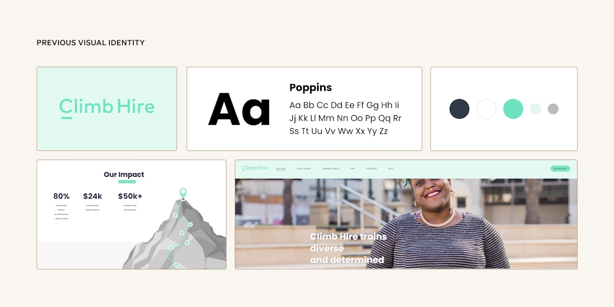
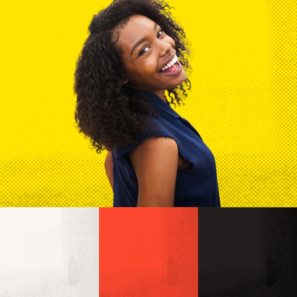
Climb Hire’s existing brand helped them achieve great things, but they recognized it was time for their next evolution. The primary teal color struggled with accessibility on white backgrounds, and the visual identity felt limiting. After evaluating their top competitors, we saw a huge opportunity for a warmer palette. Additionally, the Climb Hire team landed on Motivating, Empathetic, and Straightforward as their brand attributes. With those insights in mind, we recommended moving forward with bold, warm colors, a focus on individuals in photography, and powerful CTAs.
We distilled our initial brand evaluation work into a Single Most Important Thing (or SMIT): Your Future is Bright. This mantra would frequently be referenced throughout the project to make sure it was being appropriately communicated.
Logo
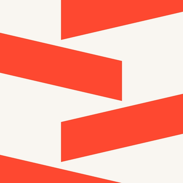
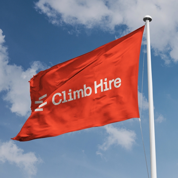
The primary mark for Climb Hire builds on the idea of, well, building. It’s an abstract representation of the upward path the Climb Hire community creates in support of its members. It’s also a testament to perseverance. Despite the mark’s asymmetry and each shape being askew, it ultimately creates a whole that’s greater than the sum of its parts.
The mark is paired with a semi-monospace typeface, a style that is completely absent from all competitors, whether in their logos or branded typographic systems.
The “H” in “Hire” has also been modified to echo the tilts of the mark and visually represent upward growth.
Visual Language
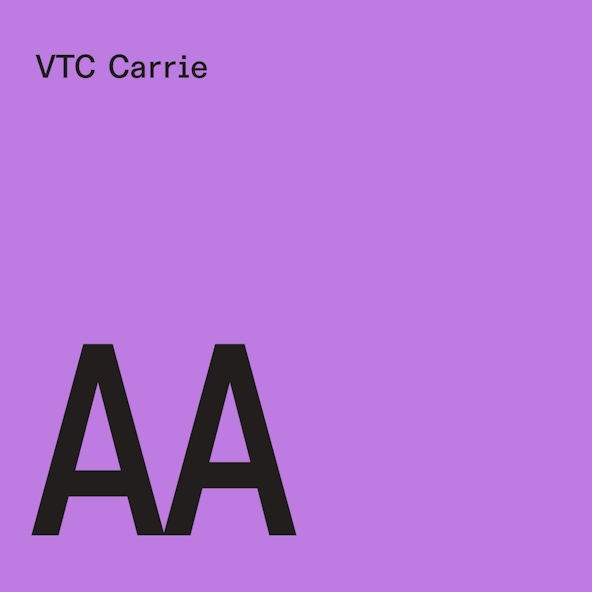
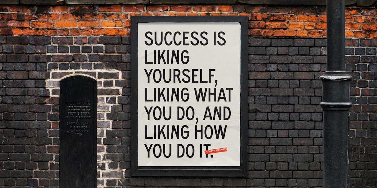
Carrie is a typeface that is full of history. Designed by Tré Seals of Vocal Type, the typeface is named for notable suffrage leader Carrie Chapman Catt and is based on protest signage from the suffragette movement, boldly speaking to Climb Hire’s dedication to lifting up others. We carried the handmade protest signage direction further by also introducing a rolled-ink texture and dynamic typography to the visual system.
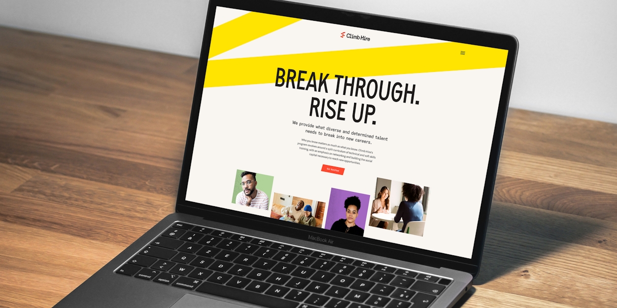
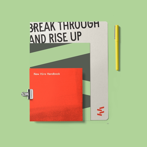
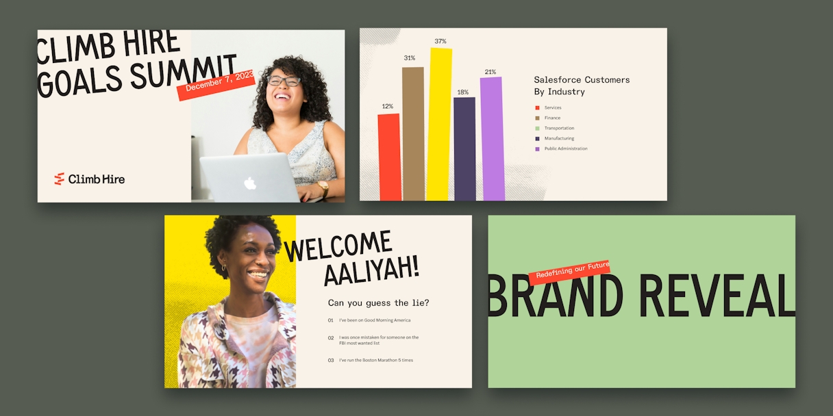
The cornerstone of the Climb Hire visual identity is the outspoken type treatment of bold, tilted headlines that bleed off the edge. What better way to represent breaking through and rising up than literally breaking through and rising up through composition? The imperfect nature of this treatment illustrates a powerful, hands-on feel that resonates with our audience of Climbers.
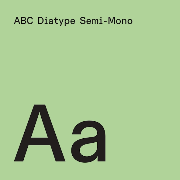
To complement Carrie, Diatype Semi-Mono captures the same grassroots feelings and pairs well with Carrie’s retro flair. Monospace fonts exist for the express purpose of typewriters and computer systems, so this choice nods to the tech landscape many Climbers aspire to. For extra cohesion, Diatype is also used for the logotype.
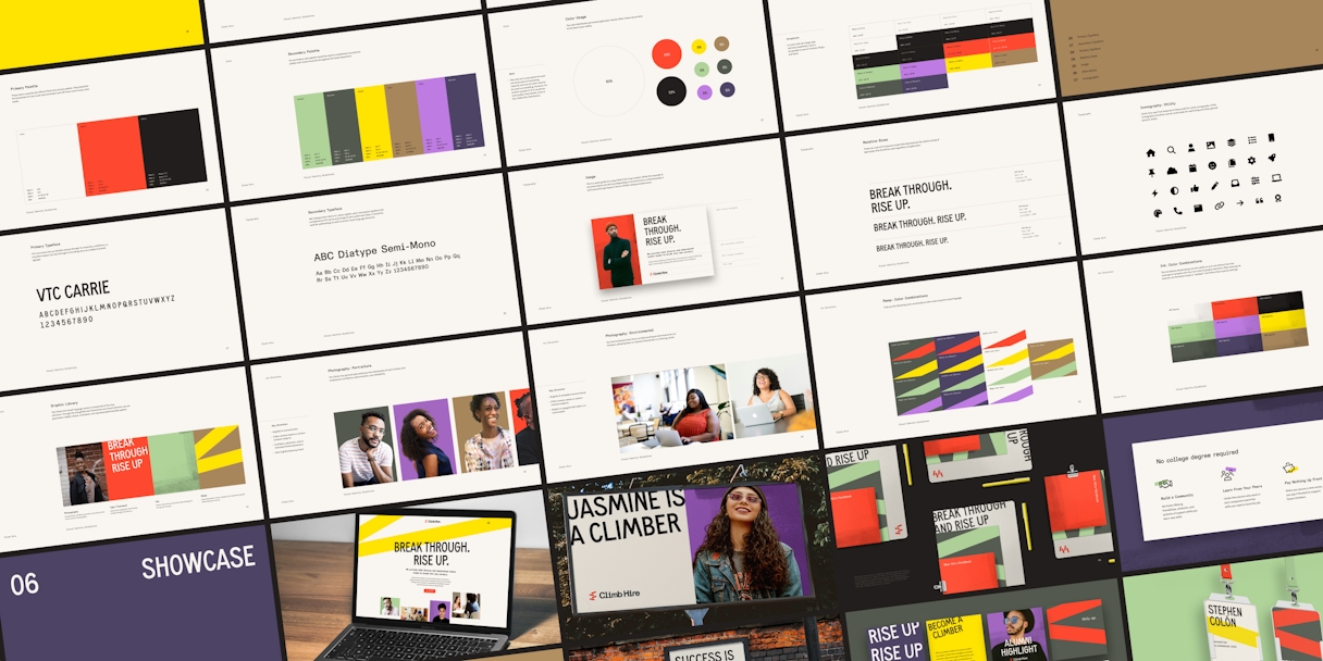
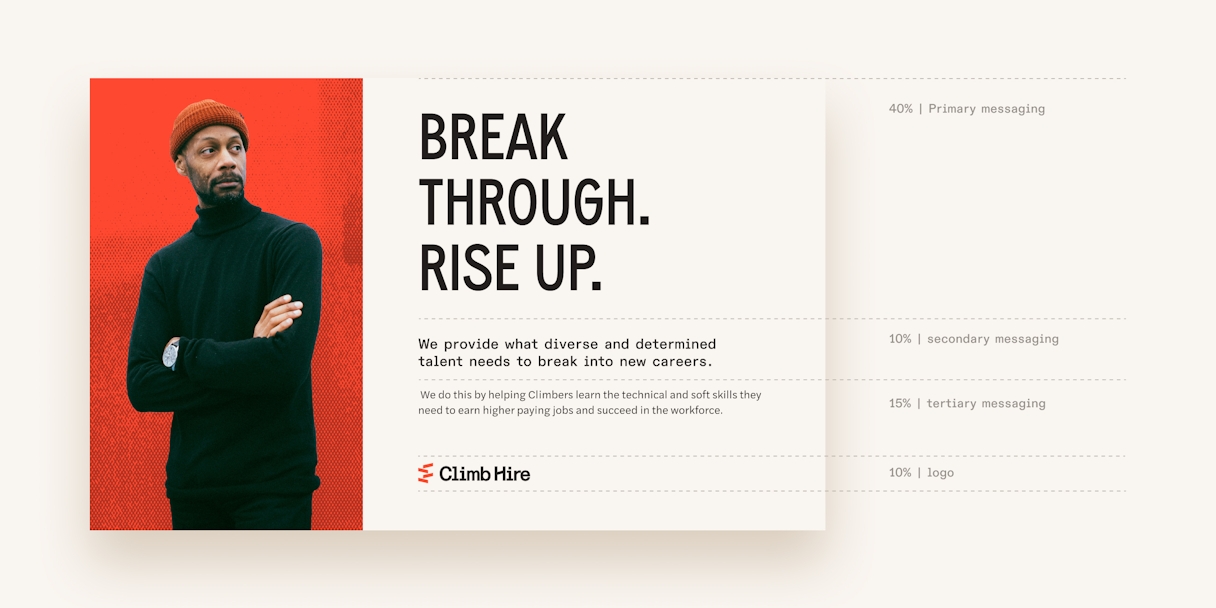
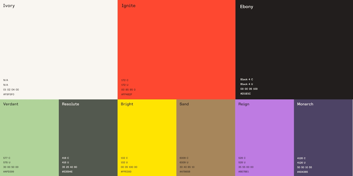
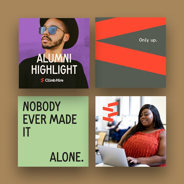
We wanted to make sure we developed a color palette so unapologetically different from the brand’s competitive landscape that Climb Hire would become the main character in every space. Initially, we explored two types of palettes: one bright and vibrant, and one a bit more subdued. In a “why not both?” moment, we combined two color palettes into one perfect blend. It provides an opportunity to create bold, vibrant impact. The variety of hues paves the way for tonal pattern executions, subtle contrast, and overall color flexibility. The added pops of motion and bold color, combined with a full-bleed application, makes the ramp language an immediately identifiable visual indicator of the Climb Hire brand.

Brand Support
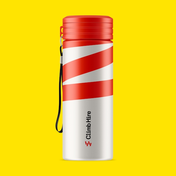
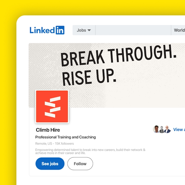
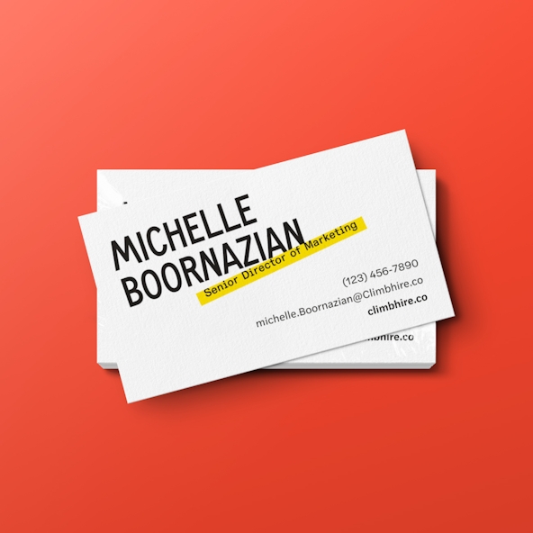
The new Climb Hire brand is vibrant and full of energy. We were lucky enough to help the Climb Hire team apply it to dozens of touchpoints through our Brand Support offering. To prepare them for their launch, we created business cards, LinkedIn banners, letterheads, social graphics, and more. We can confirm the brand is just as fun to implement as it was to create.
I’m absolutely ADORING designing with our new brand! Huge shoutout to Odi — y’all are absolute GOATS of the design space. It’s such a fun experience to share stories about our Climbers through a brand lens that truly captures the work we do. If you’re looking to rebrand, I beg of you — please work with this team!