Amplify
Amplify Group is the go-to-market and revenue expert, providing consulting services to B2B startups and small- to medium-sized businesses.
Effectively and efficiently bringing products or services to market can be a complex and challenging process involving multiple steps such as market research, customer segmentation, product positioning, pricing, distribution, and marketing and sales execution. Amplify solves these problems by empowering emerging businesses to accelerate growth through scalable revenue leadership, digital transformation, and integrated partnership.
Baseline Evaluation
Revenue is a fundamental measurement for continued fundraising and survival. Amplify’s on a mission to make GTM (marketing, sales, and customer service) easier and more approachable for more startups to succeed. Amplify’s new brand needed to reflect that goal, and after auditing the visual identities of their competitors, we identified opportunities for distinction and clichés to avoid.
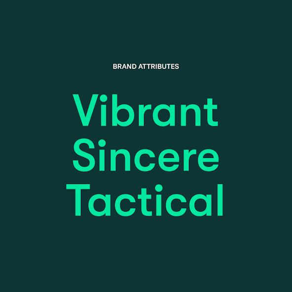
Then the Amplify team identified their brand attributes as Vibrant, Sincere, and Tactical. These led us to their Single Most Important Thing (aka SMIT): Sincerely Spirited.
We explored simple, subtle color palettes, vintage color palettes, serif typefaces, and a few non-traditional logo lockups.

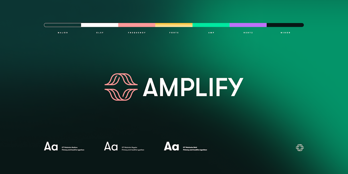
Logo
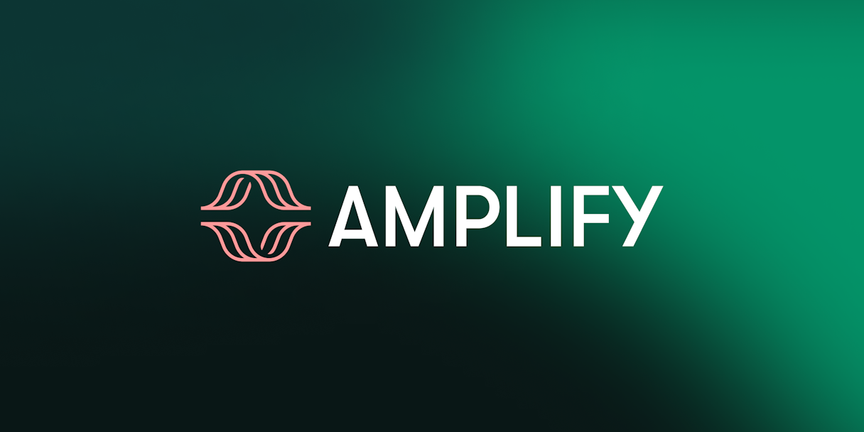
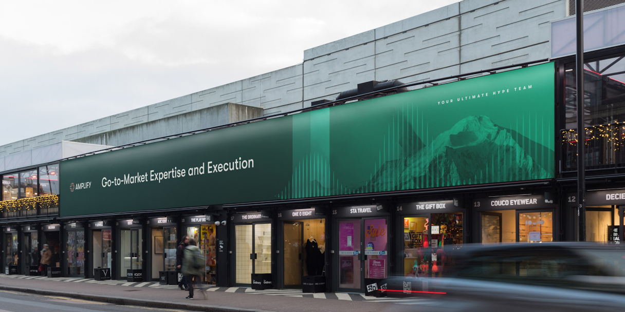
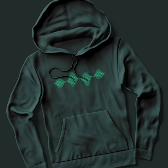
Amplify’s mark is called Wavelength, taking inspiration from frequency waves. Like the name suggests, Amplify amplifies their clients’ impact.
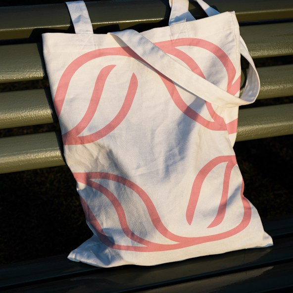
This mark lands perfectly in the spot of unique and representative. It feels nuanced, without feeling overly masculine or techy. We also pushed the connotations of growth with leaf-like compositions.
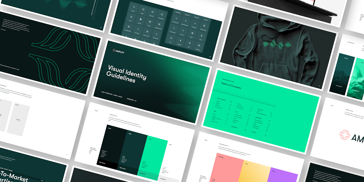
Visual Language
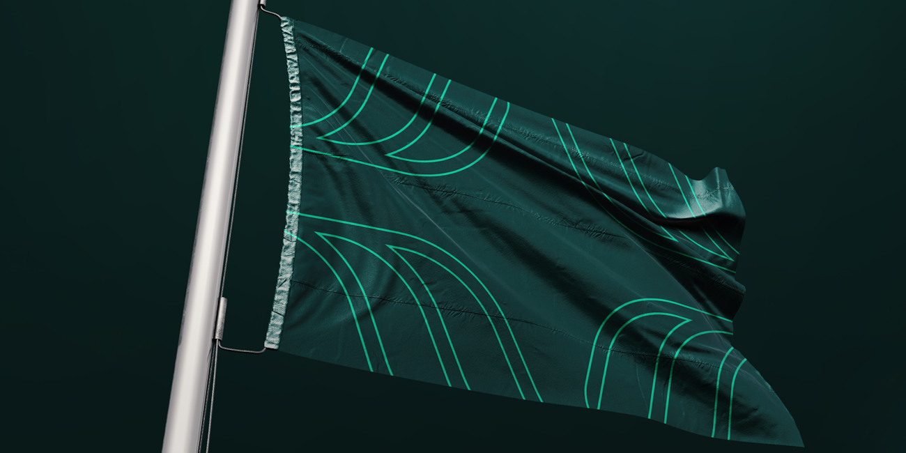
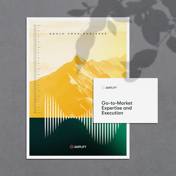
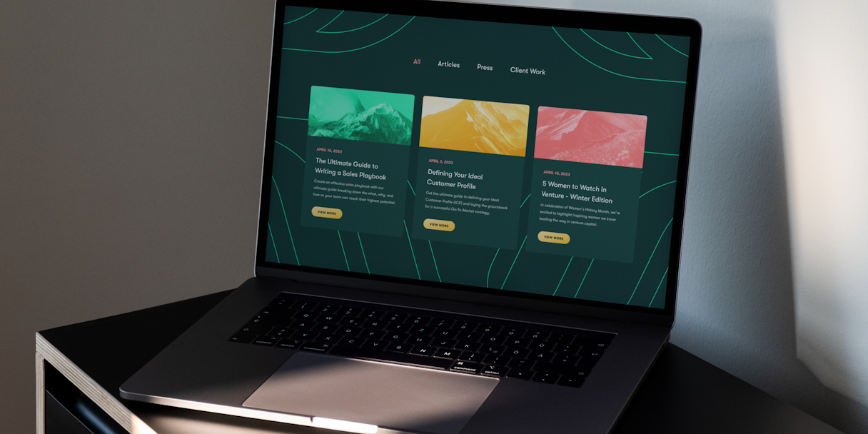
The Broad Frequency pattern is intended to mimic the impact that Amplify has in the GTM space, using simple repeating shapes to create waves. It can be used at different scales as a background element to add some depth and aesthetic interest. A closer cropped frequency wave and scale graphics work well in this visual identity.
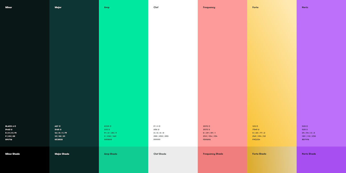
This color palette showcases a balance between Amplify’s Vibrant and Sincere values. Deep greens ground the brand in subtlety while unexpected bright hues bring hits of excitement and joy.
Amplify’s photographic presence is almost solely focused on mountains and mountain ranges. Used sparingly, these elements highlight the upward trajectory and scaling of a client’s business or product.

From the initial consultation to the final implementation, working with Odi has been an absolute pleasure. They took the time to understand our company’s vision, values, and goals, and translated them into an innovative, impactful, and cohesive brand identity. Their attention to detail and dedication to capturing our essence was remarkable.