Vizard
Vizard is a web-based solution for video content repurposing. With a product that feels like magic, they needed an identity to match.
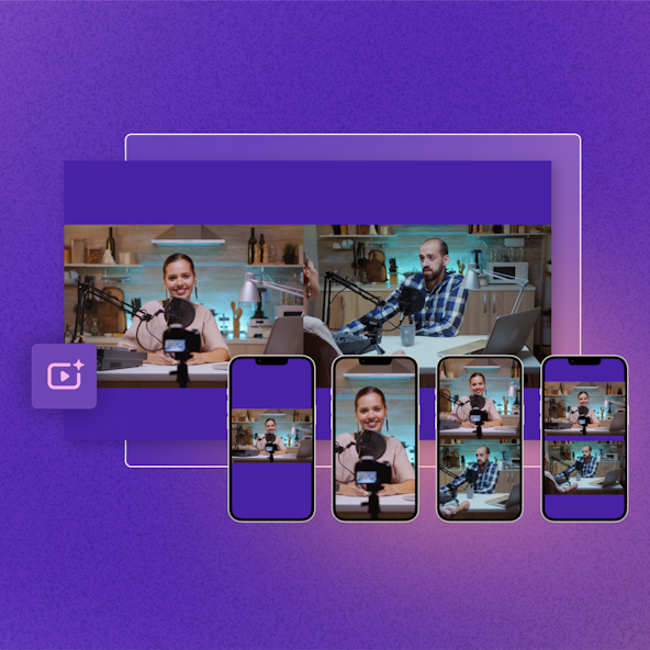
Vizard helps content marketers fully utilize what they have on hand, create stunning content at scale, and reach more audiences. Their products leverage advanced technologies such as voice and image recognition to help customers create engaging and interactive videos effortlessly.
Brand Evaluation
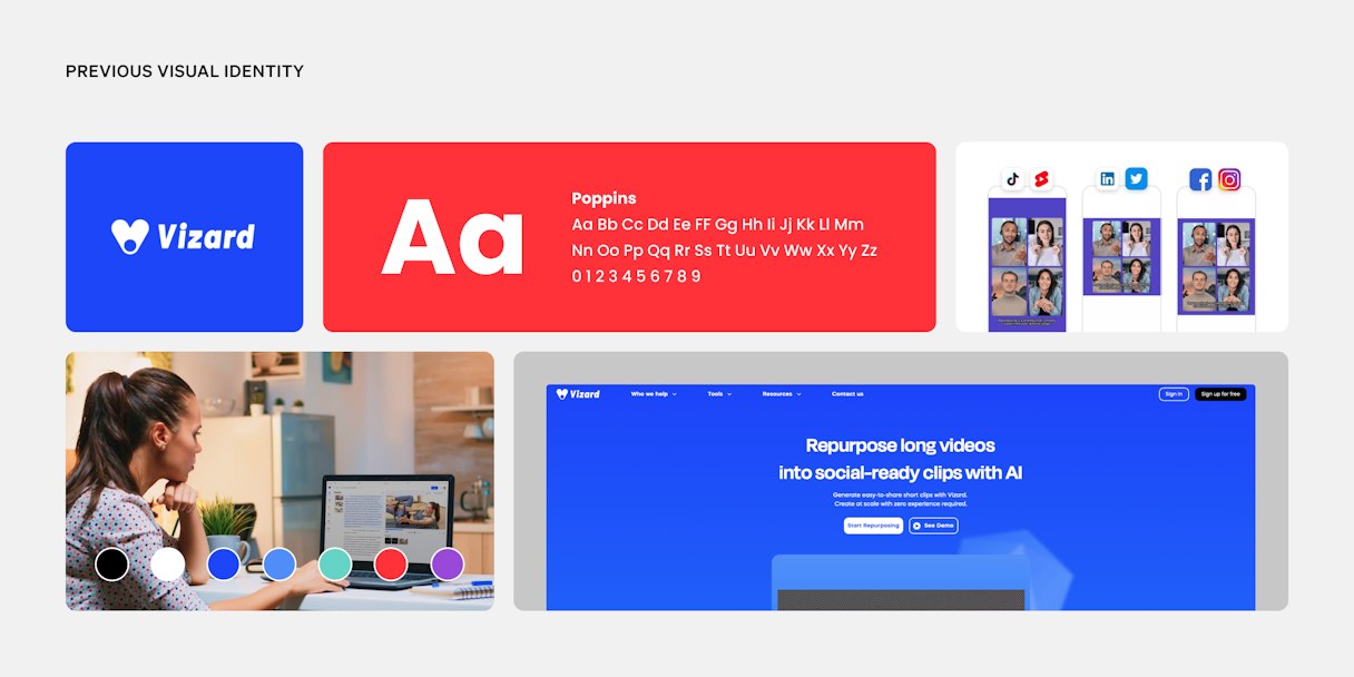
Video content is a key pillar to successful content marketing strategies, but traditional video editing software has a steep learning curve and high price tag. Targeting non-professional video editors, Vizard has to feel effortless for the time-strapped content marketers and social media managers trying to get a timely Reel produced and published. Appropriately, the Vizard team identified their brand attributes as Effortless, Transformative, and Essential.
From there, we arrived at their Single Most Important Thing (SMIT): Enchantingly Intelligent. The new Vizard brand needed to capture that sense of magic when a technology works effortlessly.
From a brand standpoint, Vizard’s competitors blend together in techy blues, gradients, and nondescript sans serif typefaces. You could easily research each competitor and struggle to remember which is which; that meant an exciting opportunity for Vizard.

Logo
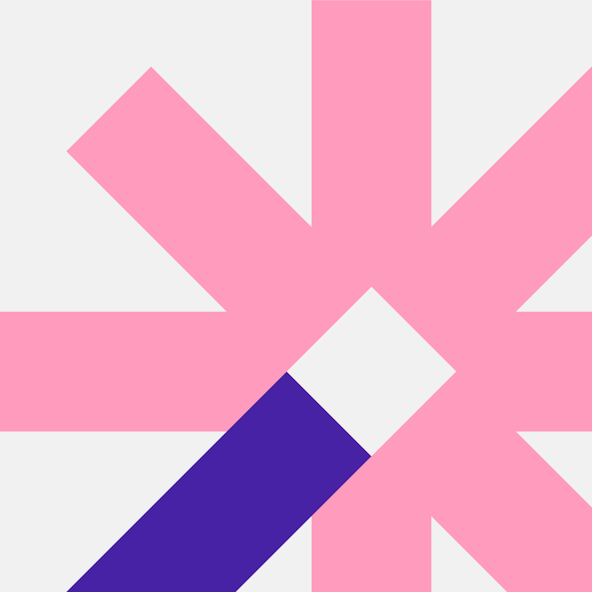
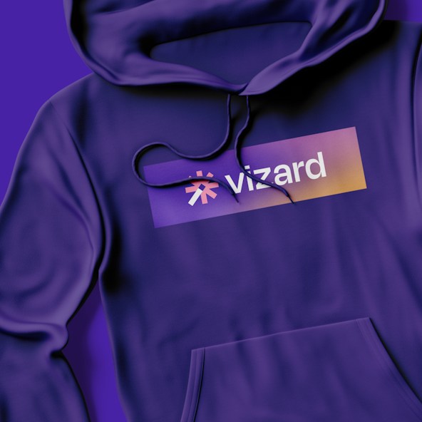
Playing into the moniker of Vizard, the logomark showcases the magic behind the brand’s capabilities. We explored a wand being the magical touch that Vizard uses to reformat videos. These explorations focused on the physical wand itself, along with the effects it conjured.
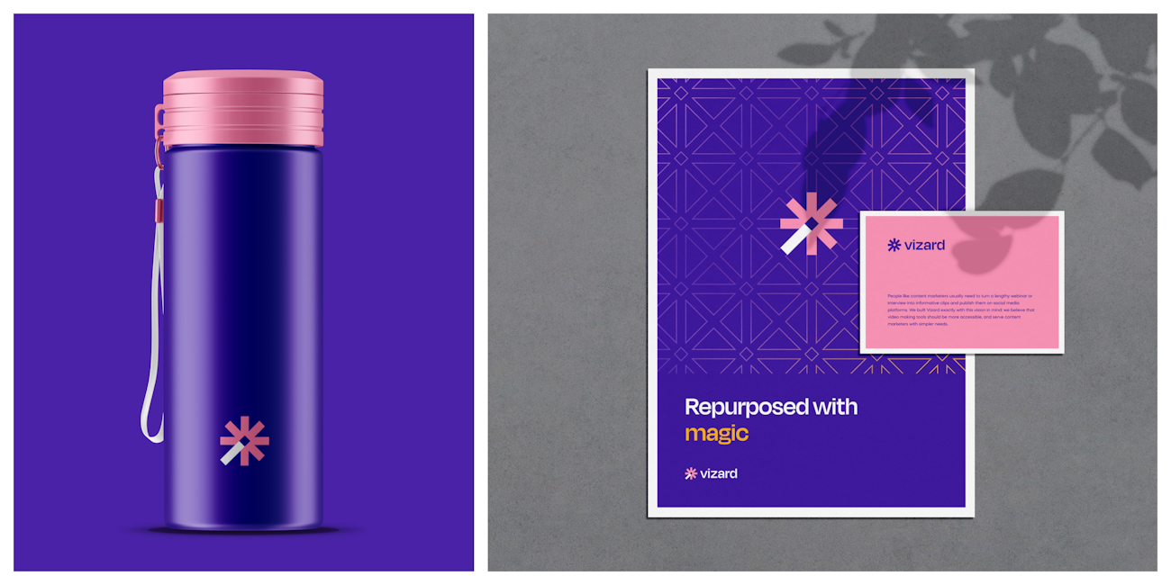
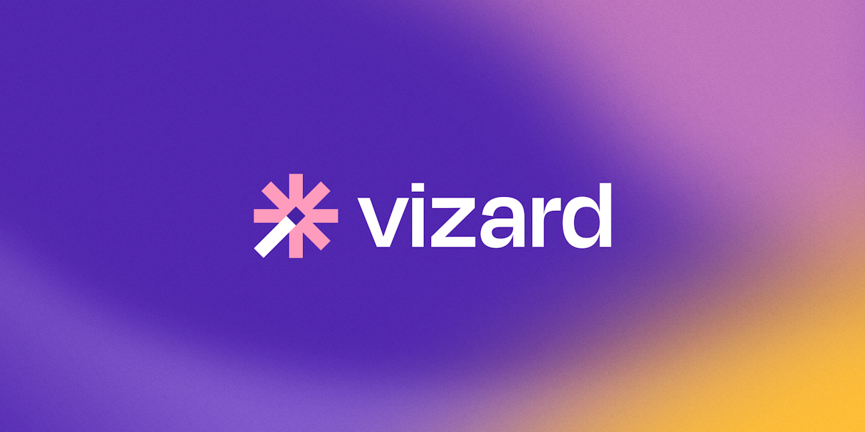
We dubbed the final mark Spark. It utilizes a spoked wheel as the encompassing shape for the wand and accompanying effects. The handle of the wand is intentionally a different color for distinction, as well as slightly extended without breaking the barriers of the container of the shape in its entirety.
The intent was to create a mark that felt tech-forward but that would not fade into the competitive landscape.
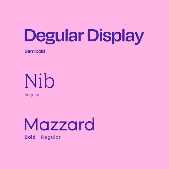
The logotype is a slightly customized version of Degular. The clean but fun letterforms paired with the heavy weight leads to a logotype that feels simple and modern, but not alienating.
Visual Language
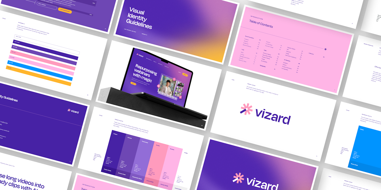
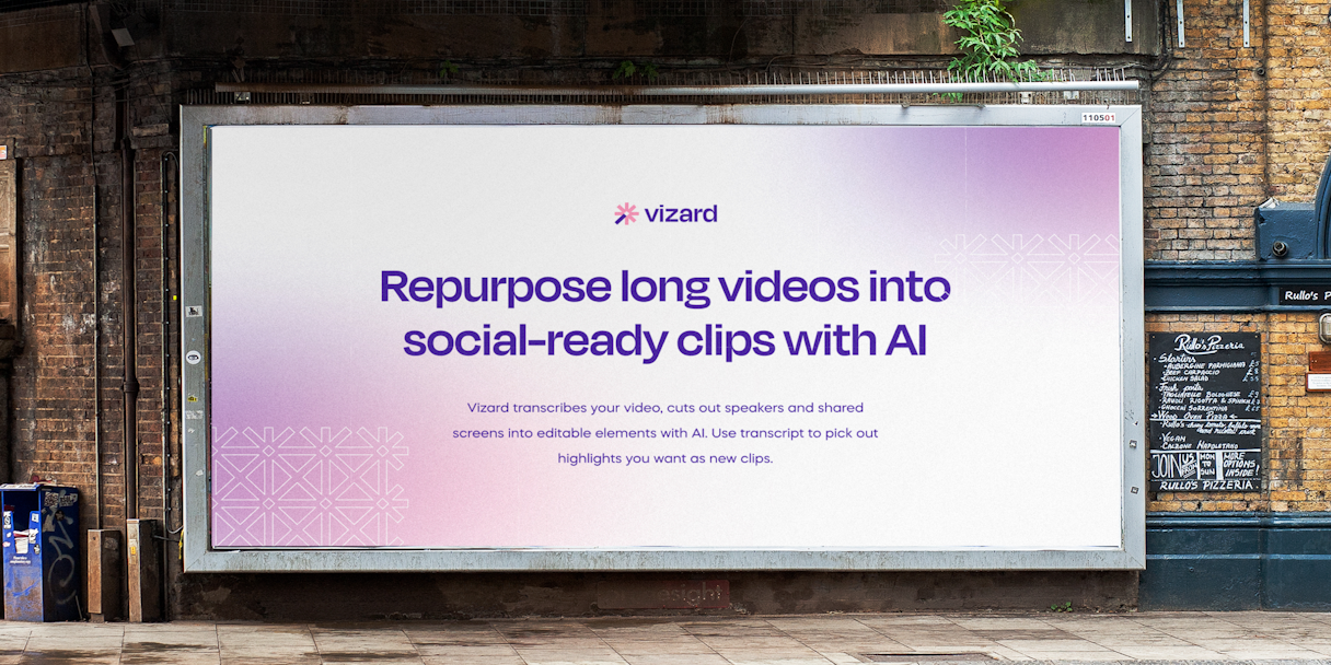
The color palette features an analogous scheme with subtle transitions between colors, creating a magical feeling and bringing the brand to life.
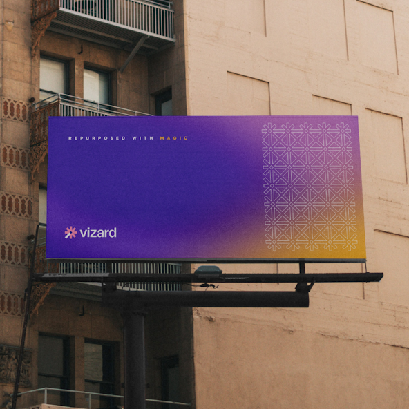
Vizard’s gradient is one of the more flexible elements of the brand. It can range from two to five colors depending on the available real estate and desired composition. The soft transitions between colors feel effortless, but enchanting, like a mysterious potion brewing in a cauldron.
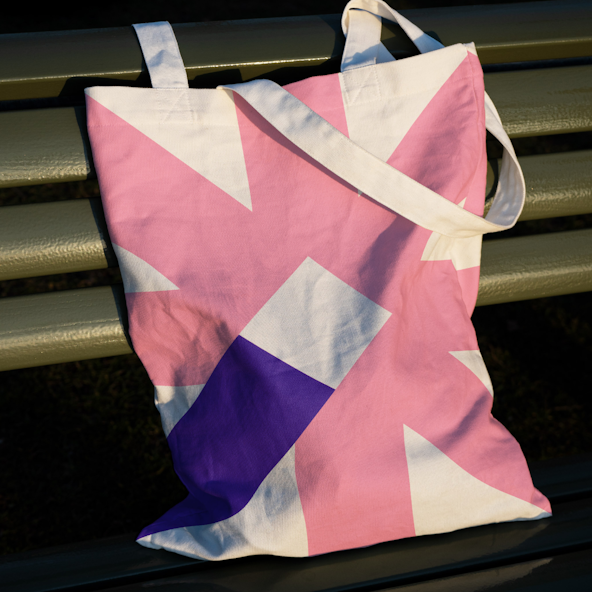
We also utilized the logomark to create a pattern that can be used in a number of ways. The repeating logomark transforms from a sparking wand into a field of geometric sparkles.



Brand Support
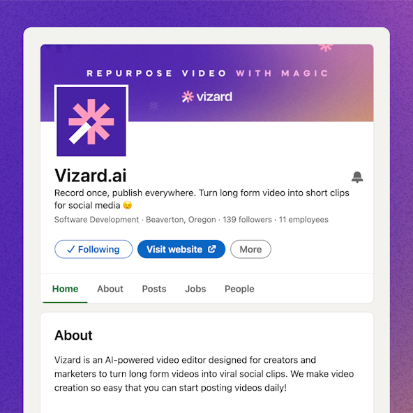
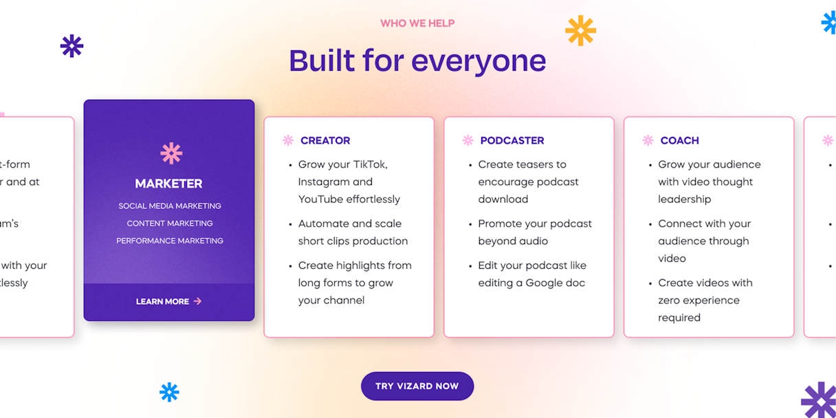
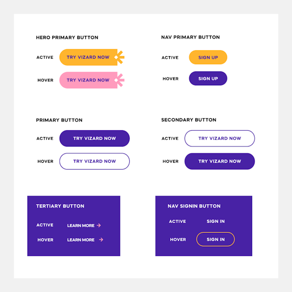
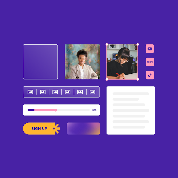
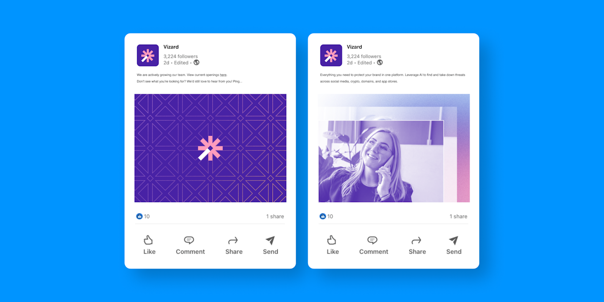
A brand’s work is never done! After finalizing the details of their new brand, Vizard enlisted our Brand Support team for help with applying it to their website, product, and social media. Gradients and subtle, but delightful, interactions help bring that sense of magic to the web experience.
