Bitwise
Bitwise was searching for a clean, crisp, cohesive brand that would help them attract employees to meet the growing demand for their work.
Bitwise is a software and technology services company that works with federal customers to support missions of vital importance to national security. The company specializes in simplifying existing software and systems with focused processes and solutions that work simply and simply work.
Baseline Evaluation
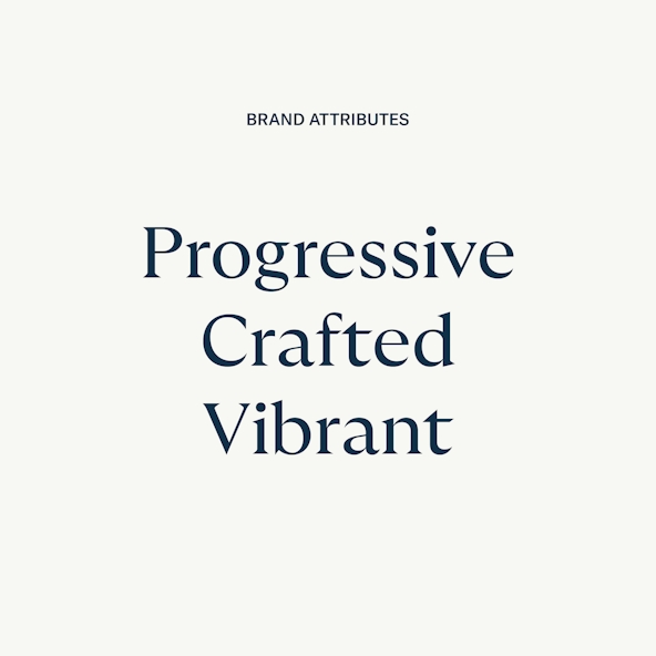
Bitwise recognized that their industry was inherently serious and often dry. Thus, they hoped to bring some fun and vibrancy to their brand while remaining genuine and authentic. The Bitwise team settled on the brand attributes Progressive, Crafted, and Vibrant. From there, it was up to us to build a brand that would propel the company forward.
First Round of Ideation
In the first round of ideation, the conceptual directions presented to Bitwise were “Elaborately Simple,” “Ground Cover,” and “Human Engineered.”
“Elaborately Simple” was progressive in its approach to color, included an extremely versatile mark, and had a logotype that straddled the line of traditional and modern.
The “Ground Cover” direction explored the relationship of people and technology. We played with ways we could combine the two visually to communicate a harmonious juxtaposition.
And finally, “Human Engineered” showcased a logotype completely drawn from scratch that communicated human touch with a nod to technology.
The Refinement Process
With the preferred direction narrowed down to “Human Engineered,” we began homing in on color and visual language. In addition to the green-and-black palette, we wanted to find other options that were relevant and pleasing.
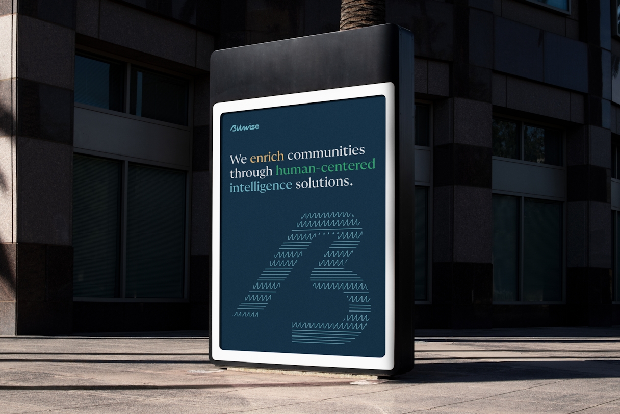
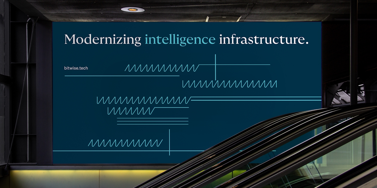
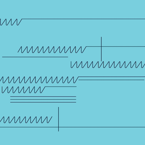
For the pattern style, we drew inspiration from the linework in circuitry diagrams. Expanding on the W shape and straight lines commonly used, we also included curved lines and connectors to make the visual language really robust and flexible.

Brand Style Guidelines
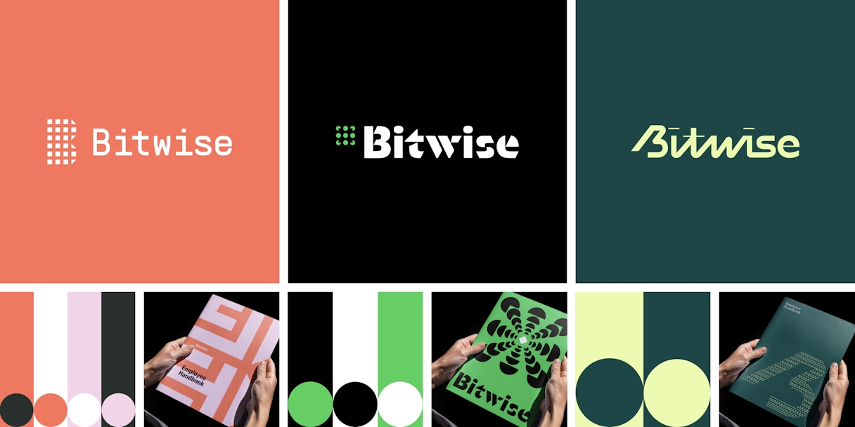
Once the final refinements were made, we crafted their Brand Style Guidelines. These guidelines spell out how to bring the new brand to life, including colors, logo and mark parameters, patterns, and more.
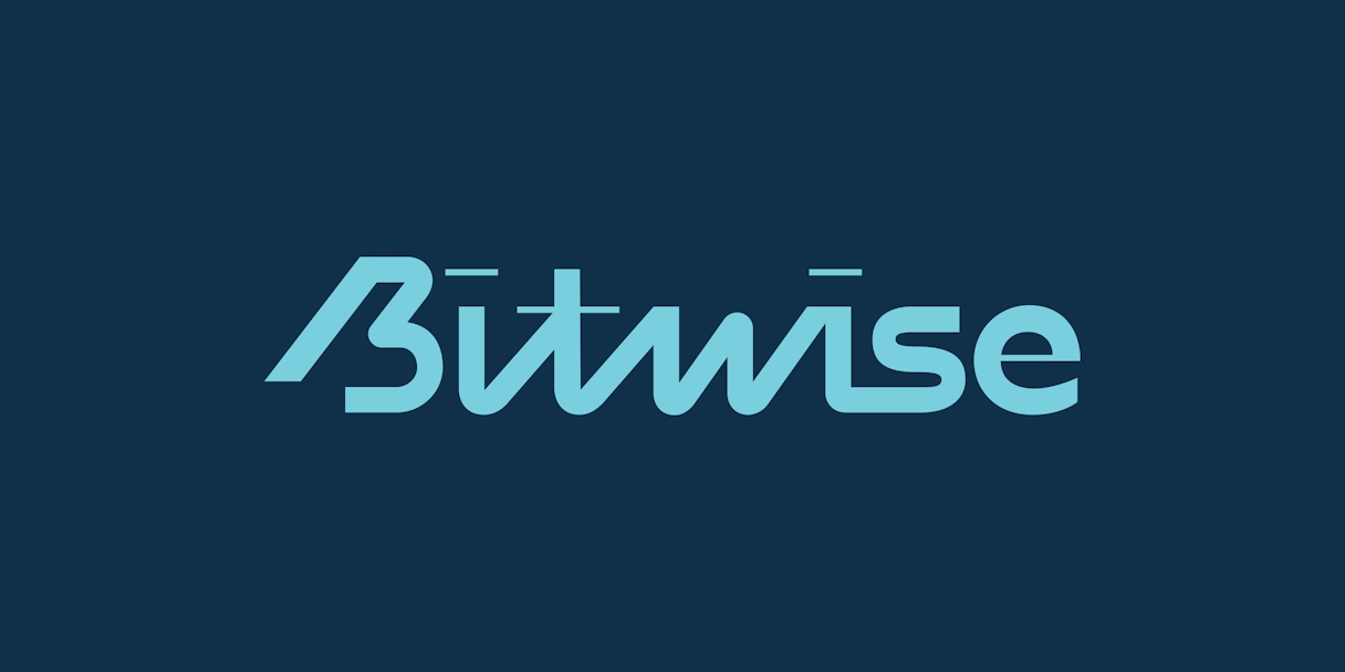
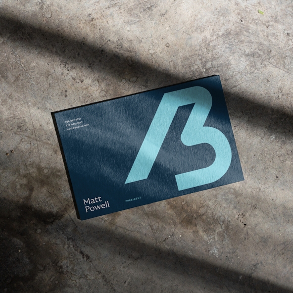
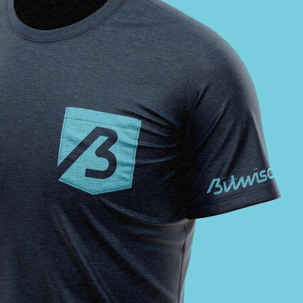
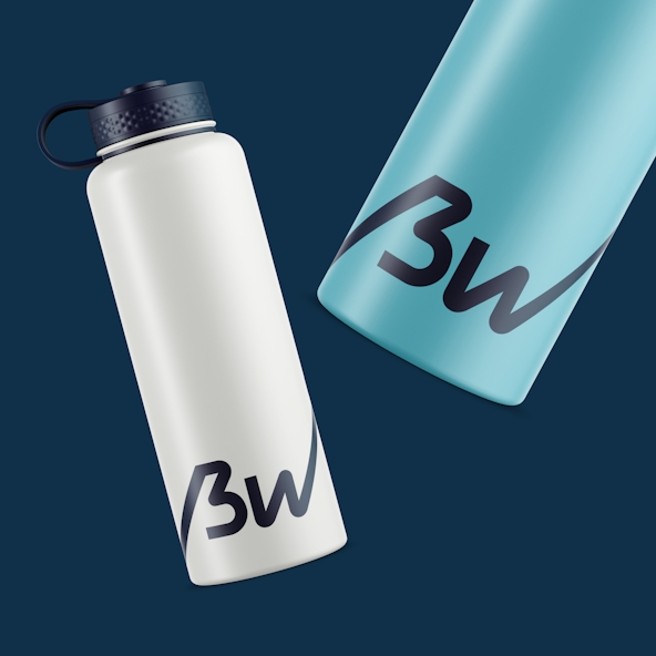
The completely custom wordmark communicates expertise and approachability while also leaning modern with its mix of thin and thick strokes. In addition, the monogram B was taken from the wordmark. It’s a bold visual that can be scaled up as a graphical element or scaled way down to favicon size.
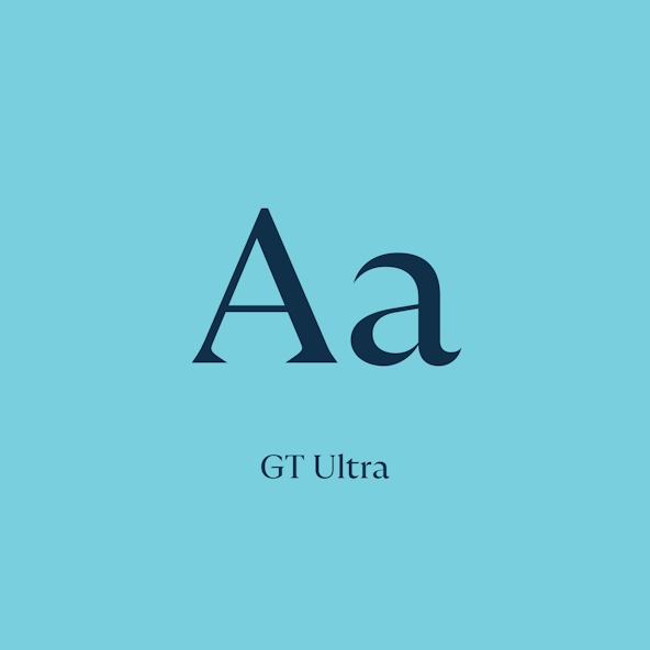
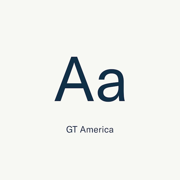
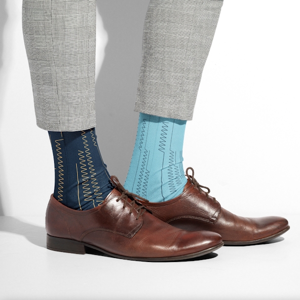
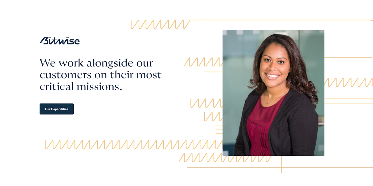
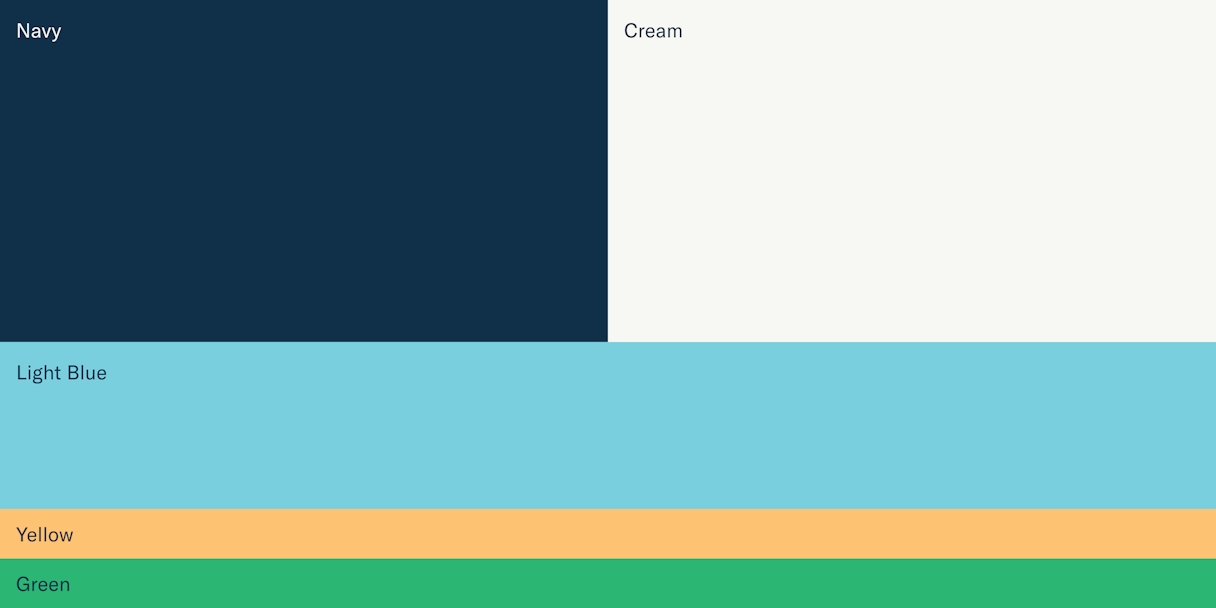
While blue may be common in the competitive landscape, there isn’t one quite like this. The light blue, yellow, and green add a welcoming vibe, while the dark blue and cream evoke trustworthiness. Bitwise’s typography combines GT Ultra and GT America to build type hierarchy.
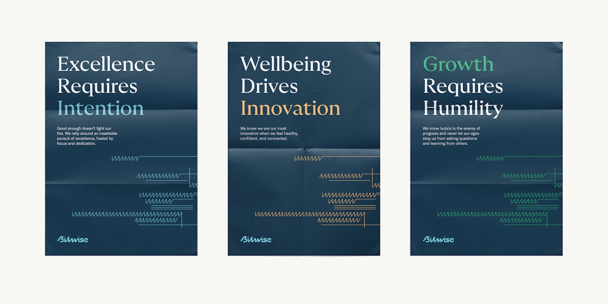
The pattern work introduced in the refinement process presented a great way to add visual intrigue to a composition. Based on circuitry schematics, it adds a crafted and vibrant feel to the overall system. There were two different versions of this pattern: one that was more elaborate (including W shapes, curved lines, and connectors), and one that was more simplistic (solely W shapes and straight lines). Either can be used based on composition and complexity.