Heliux
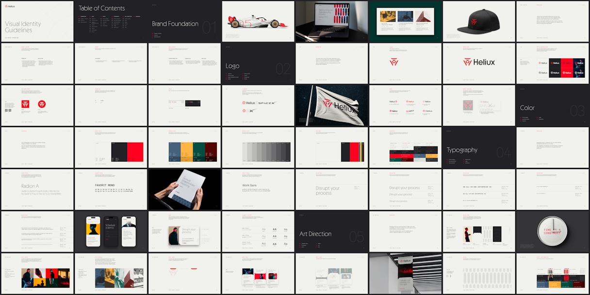
When you’re bringing an AI-powered, all-in-one enterprise operating system to the engineering and manufacturing communities, your brand identity really has to show up.
Heliux provides the software that centralizes cross-functional teams, operations, and data into a single system of record for these critical fields. Their offering powers the companies who make rockets and satellites and robotics and clean energy solutions—the kinds of things that directly impact humanity. And yet, the software they used to support that work hadn’t seen innovation in decades. The tech was legacy and outdated. Enter Heliux.
For Odi, the goal was to telegraph Heliux’s next-generation solution through its brand look and feel. We wanted a refreshed identity that would empower customers and attract talent; something as mission critical and exciting as the problems Heliux (and its customers) solve.

Brand Evaluation
Heliux serves early-stage, mid-market, and enterprise hardware engineering and manufacturing companies in the aerospace and defense, automotive, and deep technology fields. To reach them, Odi knew it was important for Heliux to have an iconic logomark. After reviewing the competitive landscape, we determined there was room for one. We also recommended a cohesive and relevant visual language system, as well as a unique primary typeface.
To pull things together, we created brand attributes that would get to the core of who Heliux is and what they do: Essential, because Heliux is essential to the core operations of their customers. Transformative, because Heliux is transforming an industry that has not seen true innovation in decades. And Unified, because Heliux provides an all-in-one solution that unifies the software experience and the people using it. No one else in the competitive landscape could claim these three attributes.
Our single most important idea for Heliux? Next-gen innovation, naturally.

Logo
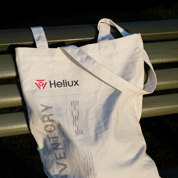
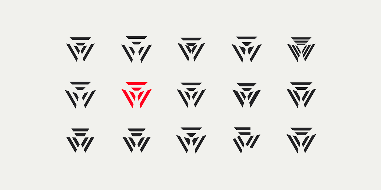
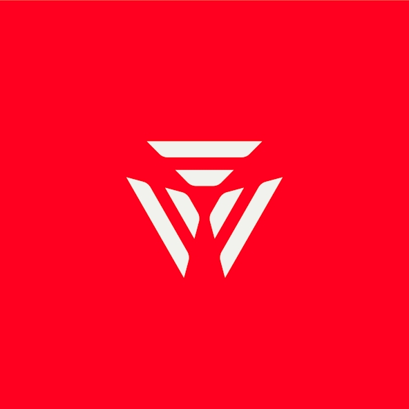
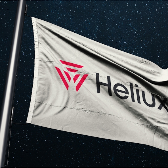
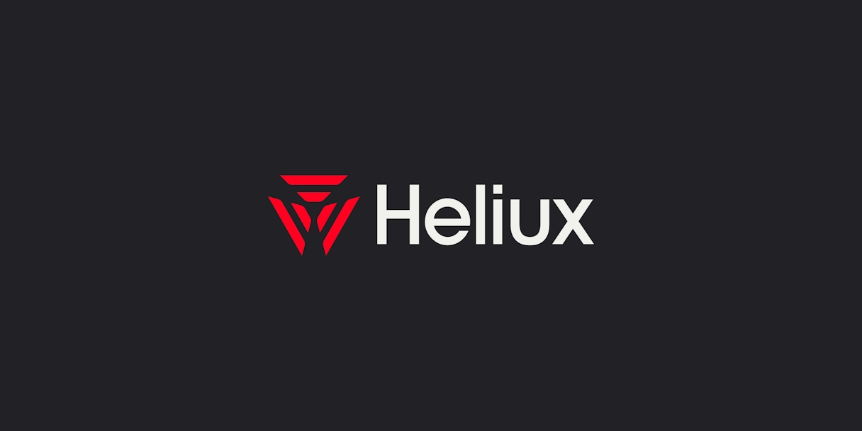
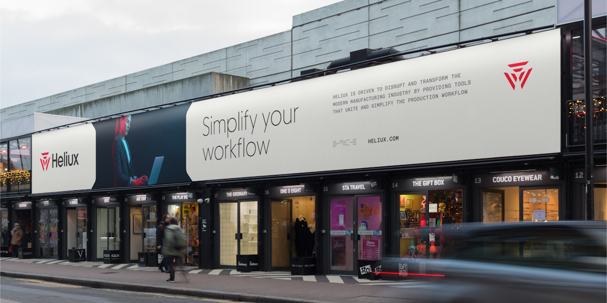
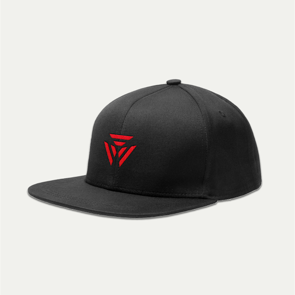
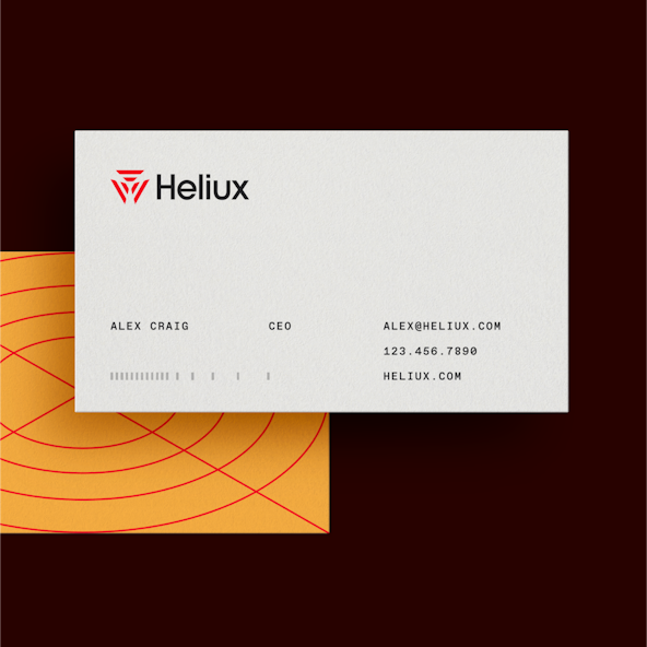
Odi landed on a powerhouse symbol for Heliux called Solara. Inspired by disruptive next-gen tech, space travel, and Helios — Heliux’s namesake and Greek god of the sun — Solara is focused yet expansive. Bold. Determined. Mission-oriented. And when paired with our preferred logotype in all of its timeless sophistication, the two take a strong and cohesive stance.
Visual Identity
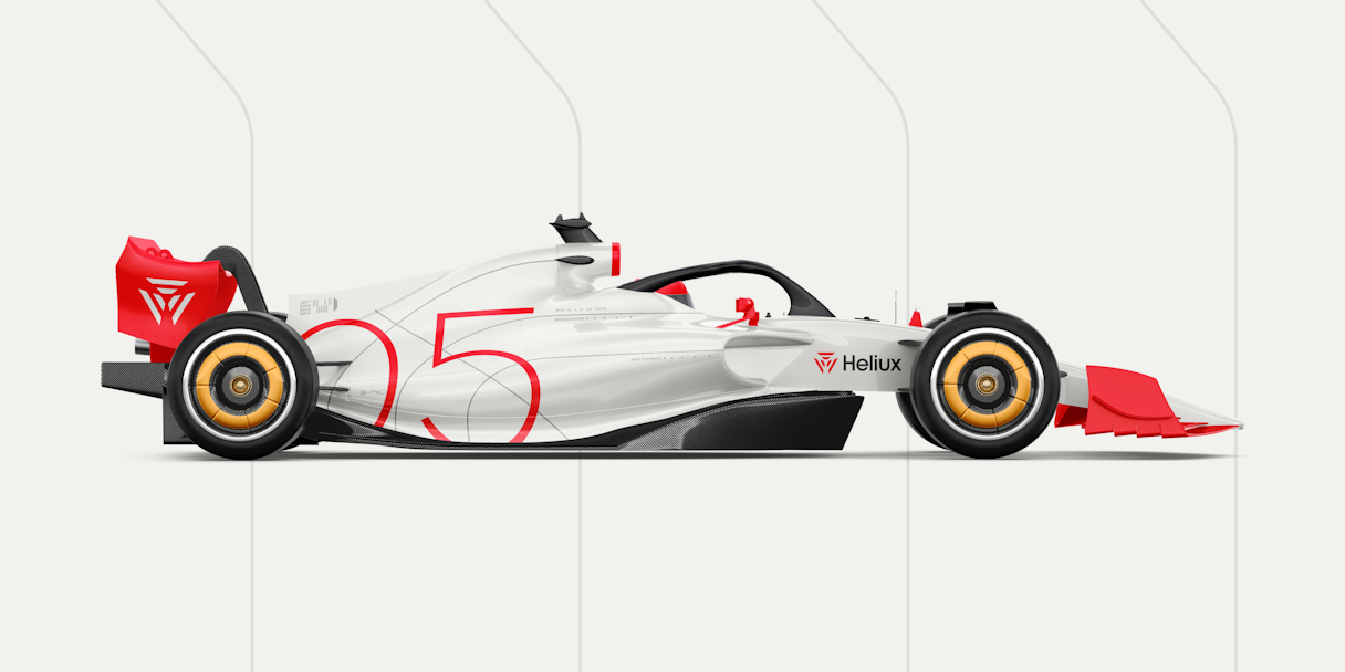
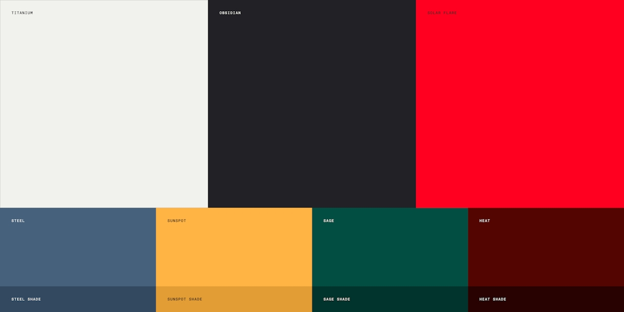
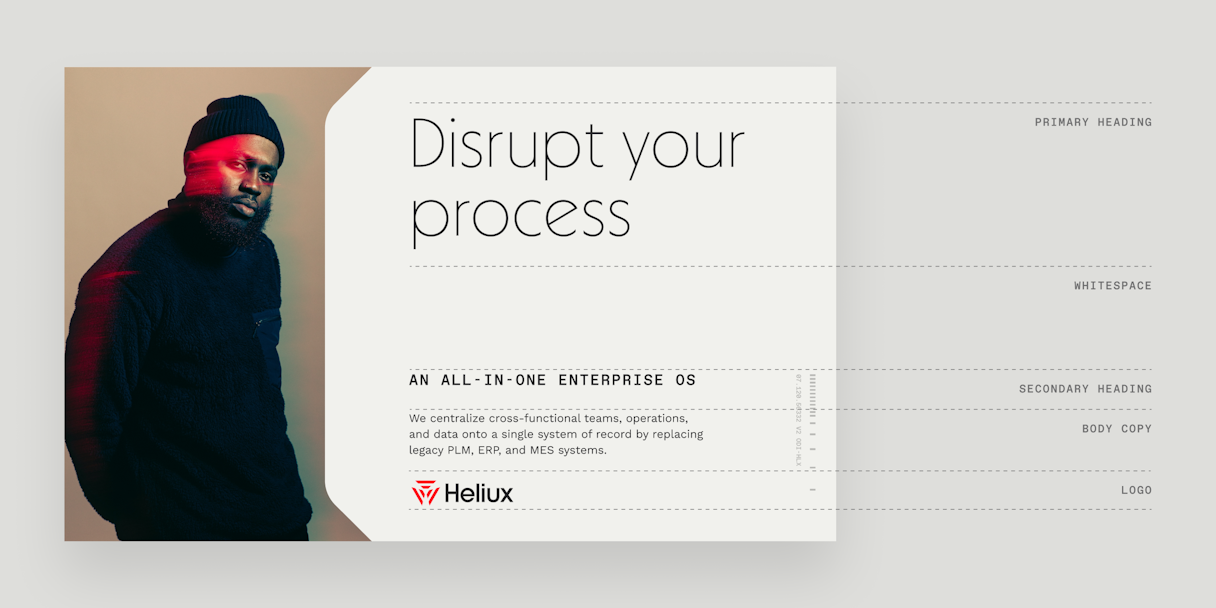
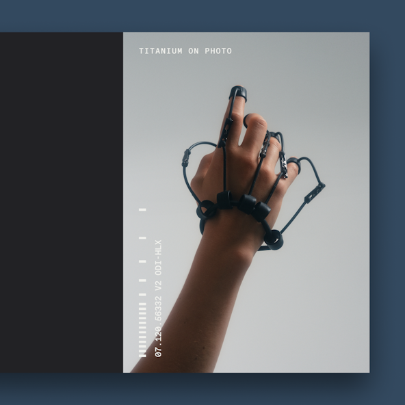
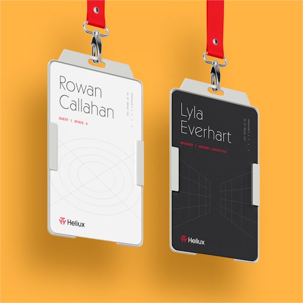
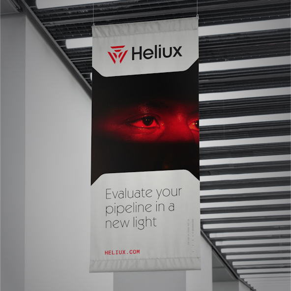
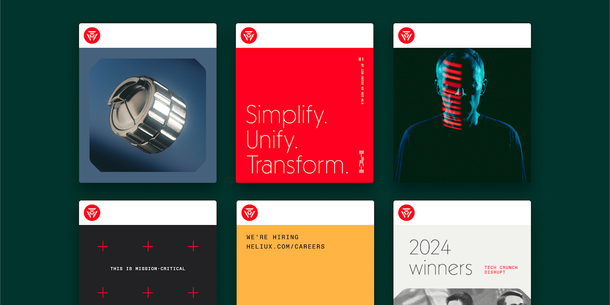
Odi chose Solar Flare red as the standout color in Heliux’s primary palette. Balanced by Obsidian and Titanium, this red matches the energy of the logo.
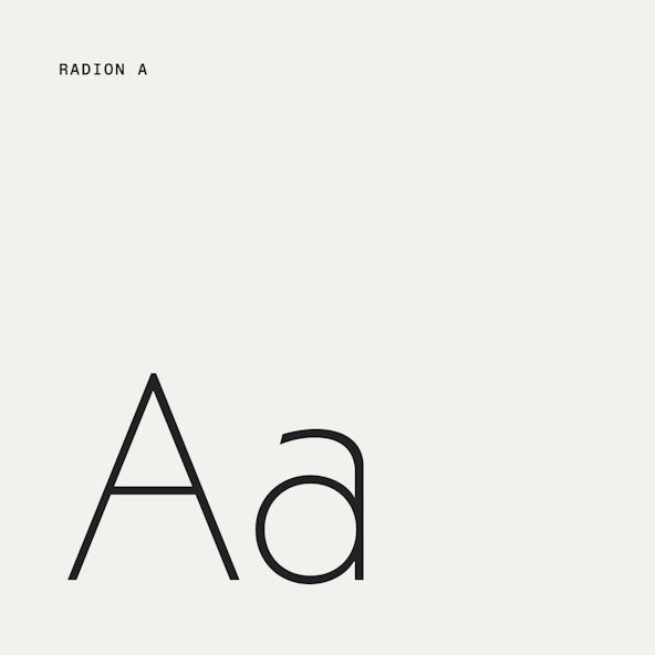
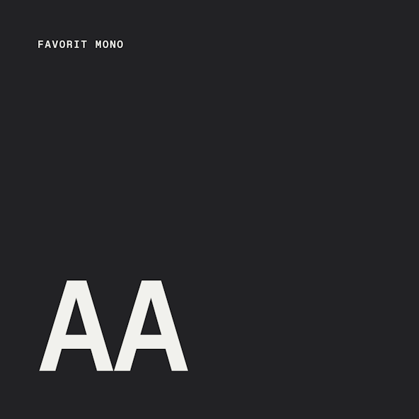
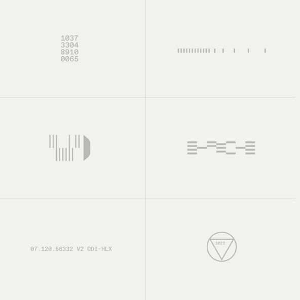
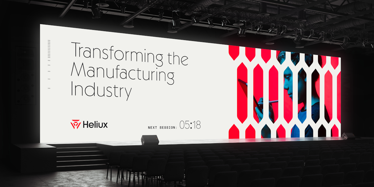
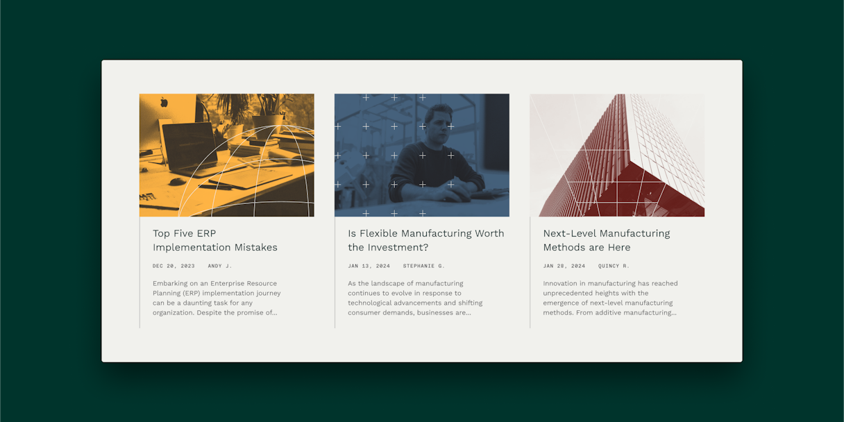
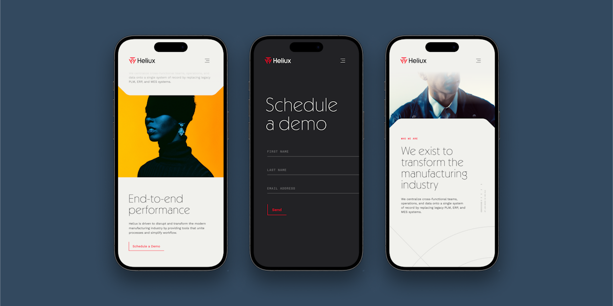
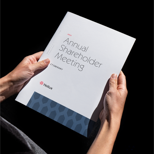
The rest of the visual language system followed suit, including a primary typeface that’s a stunning, hypergeometric sans serif and feels nostalgic and futuristic at the same time. Bold and experimental photography. Shape language that makes use of the shapes found in Solara. Line language that provides a technical and refined graphic style to materials.
Together, these elements convey the right balance of innovation, precision, and simplicity for Heliux.

It's been awesome working with this new brand, feeling proud of it. Being excited about the energy you can feel it with that; the color tones, with the abstract design. It's just energy and focus. And, it represents who we are.
