Speakeasy
Speakeasy is accelerating innovation by making it easy for developers to create or consume any API.
APIs facilitate communication between two software components, which is often the initial stage for development. Speakeasy allows a single builder to harness the talent and work of hundreds in a couple lines of code with support through high-quality software development kits, API tooling, and developer tools. With their previous visual identity, Speakeasy was severely limited.
There were inconsistencies between their tone and visuals, and the brand was built on a bright and playful color palette that didn't really match who they are and what they offer.
Speakeasy empowers developers and with Focus Lab's strategic rebrand, their new visual identity aligns with their innovative, developer-first mission.
Baseline Evaluation
To further explore how a brand identity can resonate with its audience, we evaluate others within the direct and broad industry who speak to the same audience. Speakeasy needed to combat preconceived notions about machine-generated code and its limitations through their competitors.
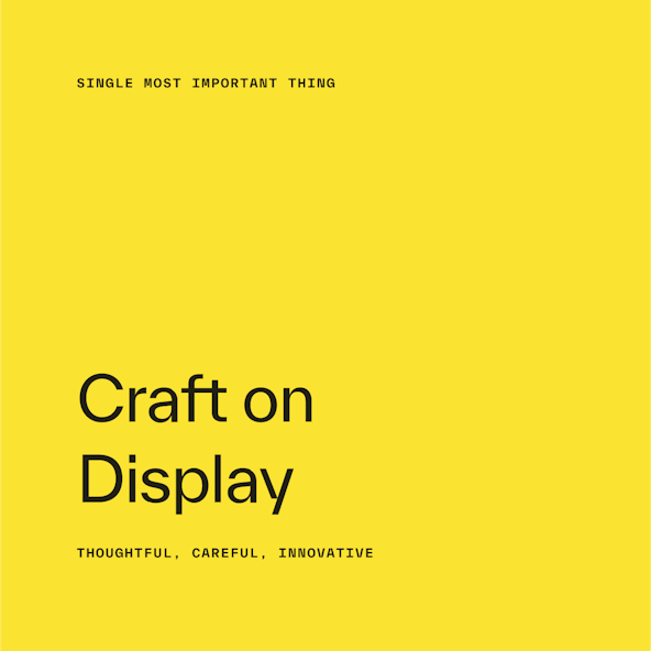
Differentiation was very important, which meant exploring beyond the blues, purples, blacks, and blue-greens of the landscape. The Single Most Important Thing (aka SMIT) for this rebrand was to convey “Crafted by Design.” Speakeasy pushes the boundary of what people thought was possible for machine-generated code, and their technology produces code that has real craftsmanship behind it, and quickly.

Logo
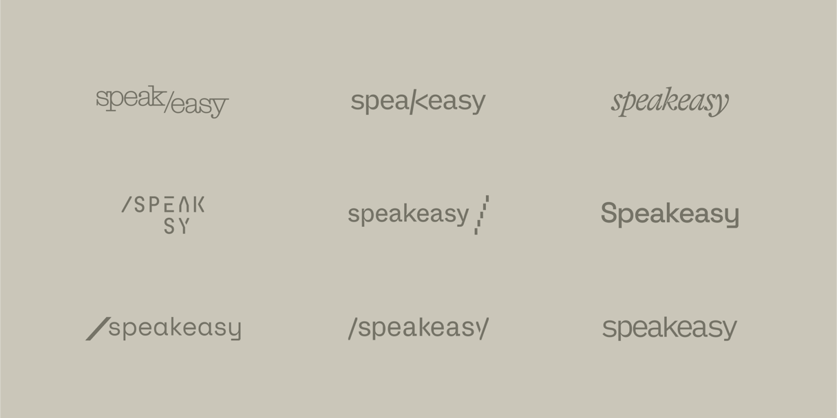
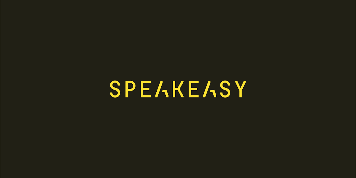
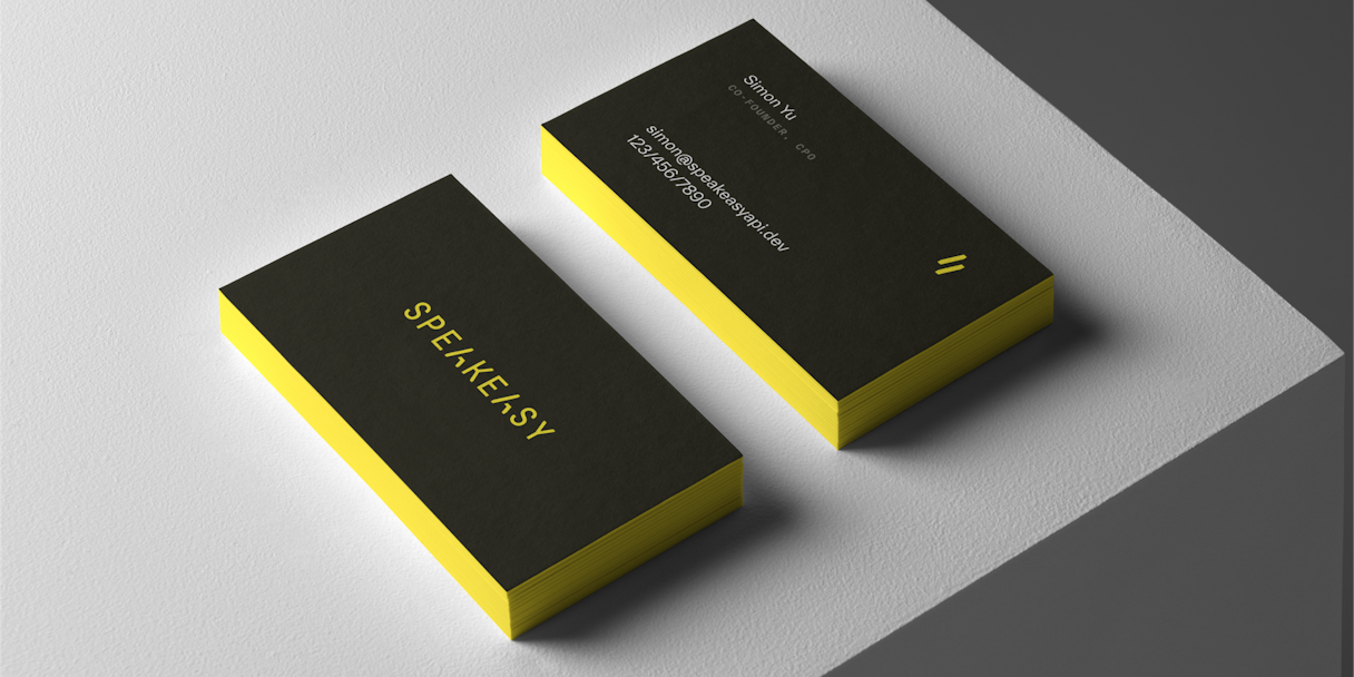
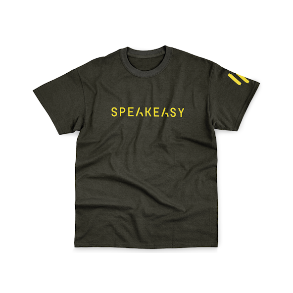
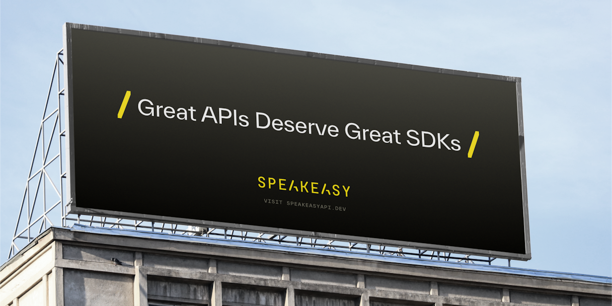
Building on Speakeasy’s brand attributes, the new logotype is distinct and ownable. It consists of technical, monospaced letterforms in which the “A” character is crafted to create two forward slashes — a direct reference to API endpoints.
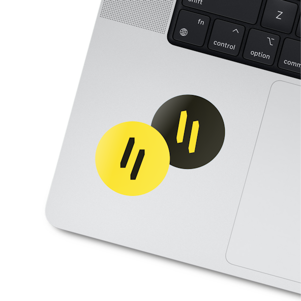
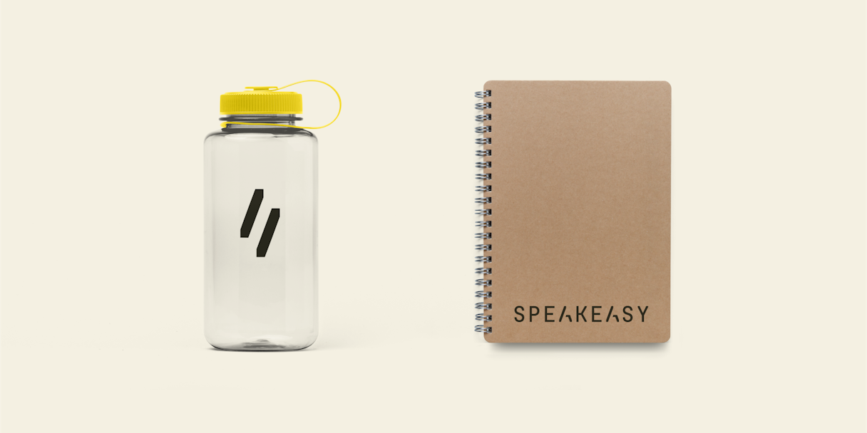
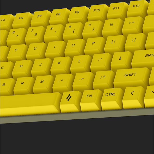
The secondary mark of two slashes carries that motif forward. The forward slash is a direct connection back to endpoints, reminiscent of the way you’d see a forward slash in an endpoint URL.

Visual Language
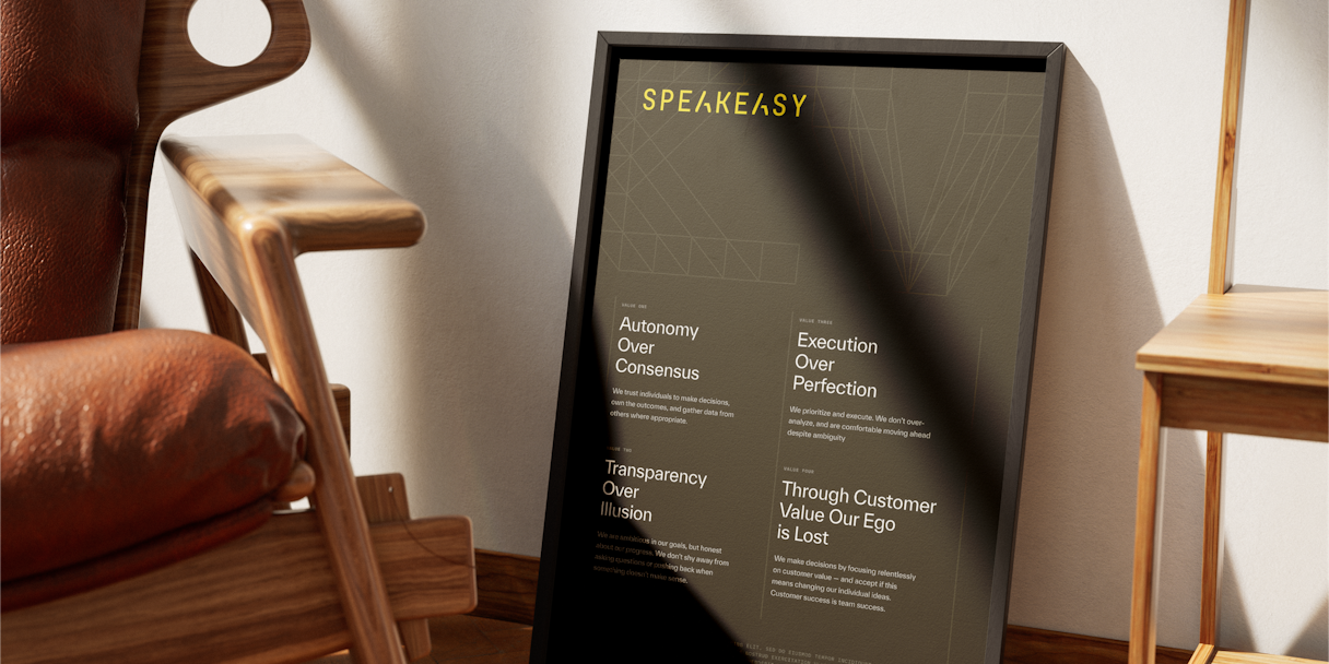
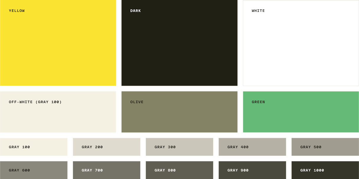
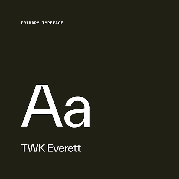
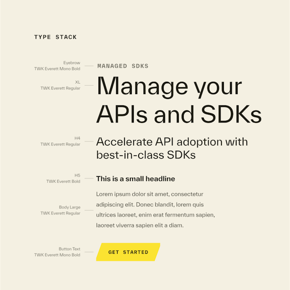
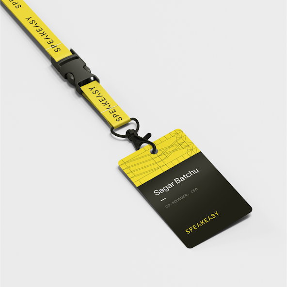
Using yellow as a primary color is almost a refresh of the previous identity, which allowed us to carry over a bit of brand equity while avoiding the categorical clichés. We paired it with an off-black for high contrast, along with more warm-leaning neutrals. We settled on Everett for the typeface, a somewhat standard sans serif, but with its sharp angles and drastic cuts it feels technical in all of the right ways.
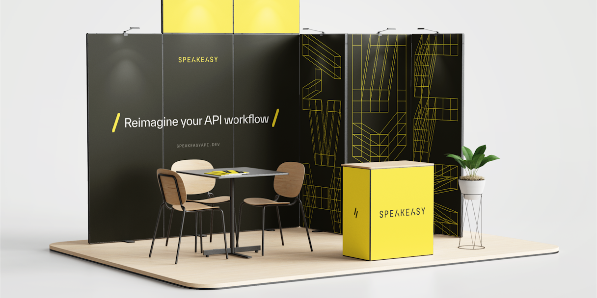
During an earlier round, we explored wireframes as a concept and pushed that idea further for Speakeasy’s visual language. After all, Speakeasy at its core is about creating, managing, and consuming APIs —
a highly technical and complicated endeavor — allowing developers to do so
with better, more streamlined communication.
We took a step back and started with a clean 6x6 grid, then began designing secret letterforms according to our grid. Nothing calls to mind the concept of a speakeasy quite like a hidden, coded language.

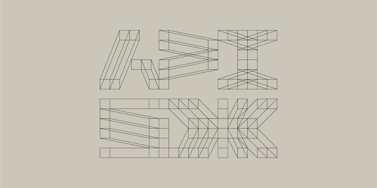
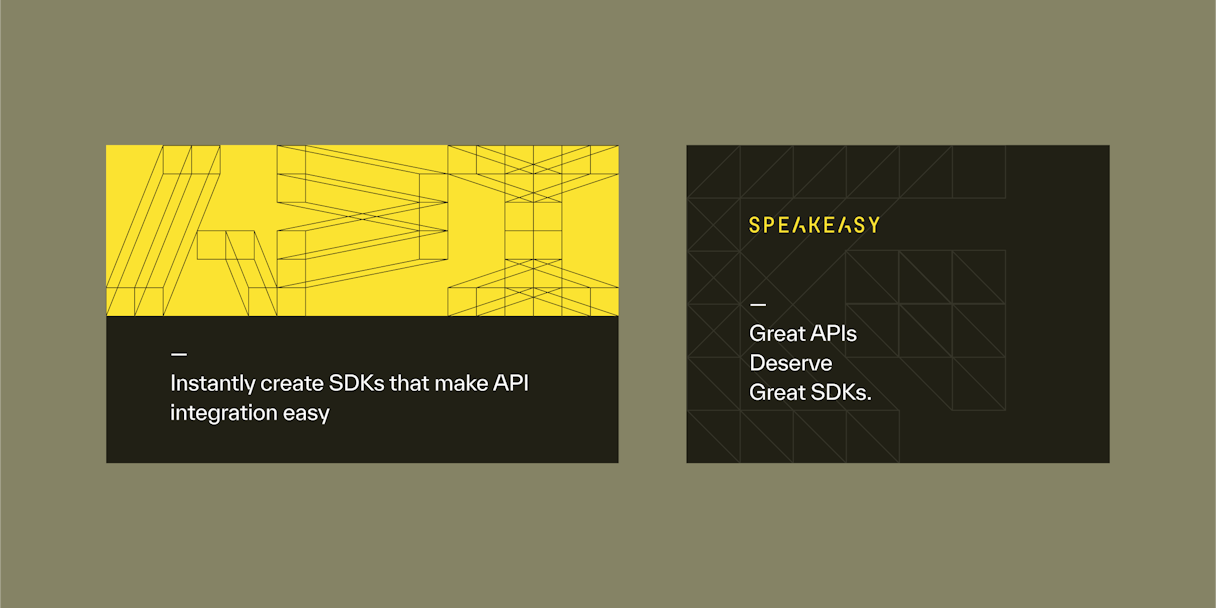
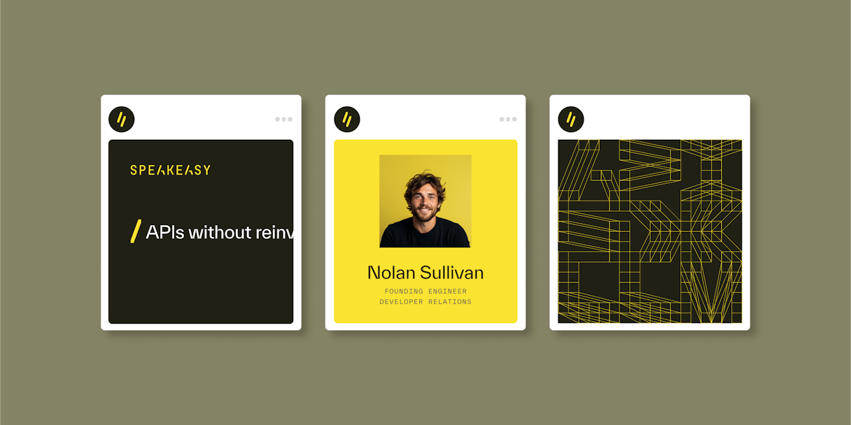
The wireframe characters can be scaled and cropped, or grouped together to include a hidden message in a composition. They can be used at high contrast as an intriguing, innovative, and prolific visual. Or they can be used more covertly with low contrast to create more of a textural background effect. Doing so also creates a nice grid structure within which to house content.
Overall, I was really struck by the very strong process, and the bar that you set. I think this has definitely been the best run engagement that I've ever had with a contractor in all of my previous work, actually.

Post-Project Impact
In the news
Speakeasy's $15M Series A