Customer.io
By leveraging data and powerful automations, Customer.io offers the only platform that product-led companies need to engage their audiences with the communications people actually want.
The Customer.io brand was versatile and vast, but its positioning fell flat, particularly with new customers. Our challenge was to clarify their value in a crowded market and help new audiences quickly understand what sets them apart by refining their messaging and visual system.
It was time to reintroduce Customer.io to the world with a brand story that captures its core mission and distinction, and in turn, allows the company to grow and expand its platform and portfolio.

Brand Insights
Customer.io began with our Brand Insights offering, an audit into their existing brand from our team. We identified a few key areas where their brand could help them get closer to their goals of relevance, evolution, and momentum.
Their team worried that their name, “Customer.io,” was limiting. We felt their name equity outweighed the limitations, and they’d be better served clarifying their positioning and revitalizing their brand. After reviewing our recommendations, we moved forward with their brand story.


Verbal Work
Customer.io came to us having outgrown their existing positioning. After exploring and testing their differentiation – and considering where they were headed – we decided to emphasize Customer.io’s data-driven and delightful-to-use nature. We refocused positioning to be about the customers themselves vs. Customer.io.
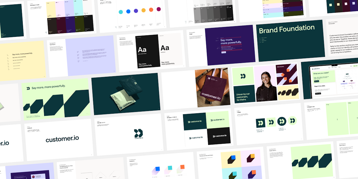
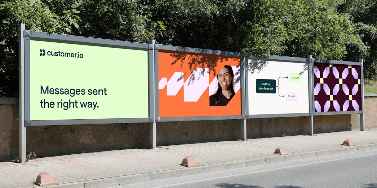
Our verbal work kicked off with a Brand Story, which established Customer.io’s ethos and injected some much-needed emotion into the brand. A USP and Value Proposition carried both the positioning and brand narrative forward and informed Customer.io’s tagline, “Say more, more powerfully.”


Logo
Customer.io’s logo was inspired by its brand attributes: Powerful, Adaptive, Human. The logo represents the brand’s data-driven approach, focus on being a user-centric platform, and commitment to activation. The three parts of the logo fit together to create a cohesive narrative, each one treating a critical aspect of Customer.io’s identity:
Data – the utilization of diverse data sources
Platform – the customer-centric platform
Activation – forward momentum

Visual Language
Our standout colors, Evergreen and Verdant, symbolize growth, harmony, and balance. They are supported by a secondary and tertiary palette that introduce brightness and energy. We landed on Saans, a typeface chosen for its personality and readability, to convey our messaging.
In keeping with the color and typeface choices, Customer.io’s professional-yet-casual portrait photography style amplifies a sense of energy, momentum, and optimism. Product photography makes liberal use of the brand palette, as well as the chosen visual language, which originates from the three shapes found in the logo.