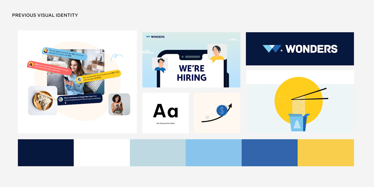
Tarro
Running a restaurant is hard work: long hours, slim margins, and a hundred moving parts to manage. Tarro exists to help restaurant owners do more with less, reducing stress and increasing revenue.
Local restaurants are the heartbeat of their communities, but their proprietors are often overworked with little return. Founded by the son of restaurateurs, Tarro understands the challenges its clients face daily and seeks to create the “technology all restaurants run on.”
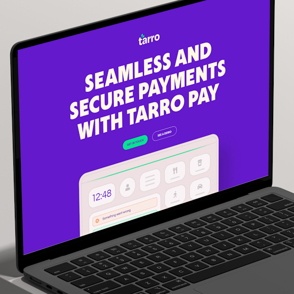
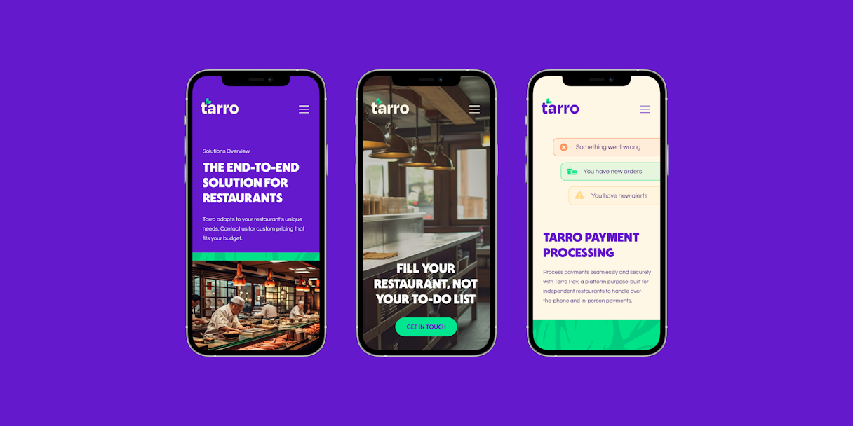
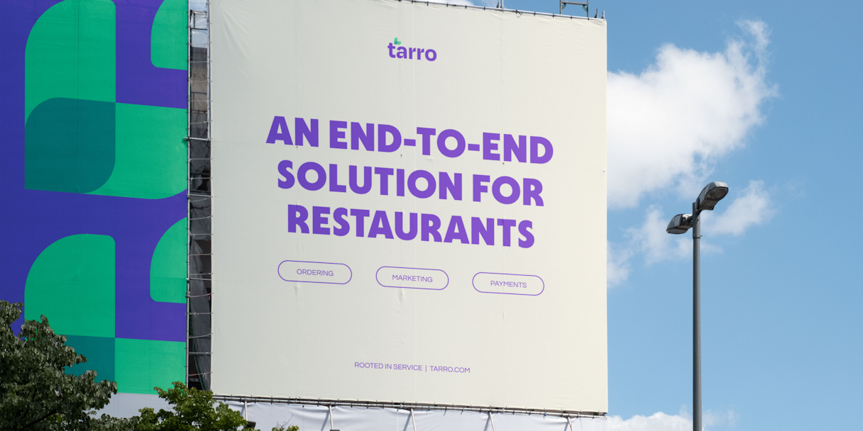
From taking phone orders to payment processing, Tarro helps restaurants see a 10% to 20% increase in revenue, which makes a huge difference for the bottom line. Already serving over 3,000 restaurants, Tarro was ready to break into new markets and needed a more established identity for its next phase of growth.
Brand Evaluation
The Tarro team identified its brand attributes as Friendly, Caring, Genuine, and Insightful. It was important for Tarro to be perceived as a trusted partner for clients. Growing up in a restaurant himself, Tarro’s CEO understands the dedication it takes to run an establishment, and the pain points that make it unnecessarily difficult.
Tarro’s most direct competitors haven’t embraced brand and feel very technical. That created a huge opportunity for Tarro to not only deliver competitive solutions, but also connect with clients emotionally and champion the unsung heroes of the industry.
After our evaluation, we narrowed down Tarro’s Single Most Important Thing (SMIT) to Satisfaction Through Thoughtful Simplicity. Tarro and its intuitive offerings exist to help restaurants run more smoothly.

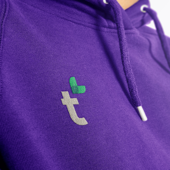
Logo
Inspired by the heart-shaped leaves that adorn a taro plant, the logomark evokes feelings of peace, hope, and joy. Although the plant didn’t inspire the Tarro moniker, it did provide a simple logomark solution that aligned closely with the brand attributes and SMIT.
The logotype is a slightly altered instance of Degular. The exaggerated ink traps give the perfect touch of playfulness to an otherwise sincere wordmark. It represents a confident yet friendly approach to a service-centric identity and symbolizes the simple thoughtfulness with which Tarro serves clients.

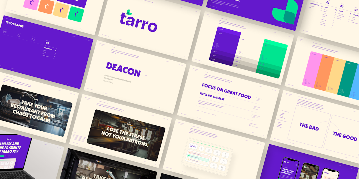
Visual Language
Deacon is Tarro’s primary brand font. Its strong and powerful design injects a sense of confidence and pride, while the heavy weight feels approachable and energetic. Questrial is Tarro’s secondary typeface, exuding a sense of professionalism and support.
The color palette intentionally conveys supportiveness and friendliness. Custom primary hues Taro and Flour anchor the brand, while a supporting cast that features Mint, Rhubarb, Tangerine, Mustard, Cilantro, Berry, and Acai gives a playful nature to the identity. The extended palettes will provide flexibility and accessibility in digital environments.
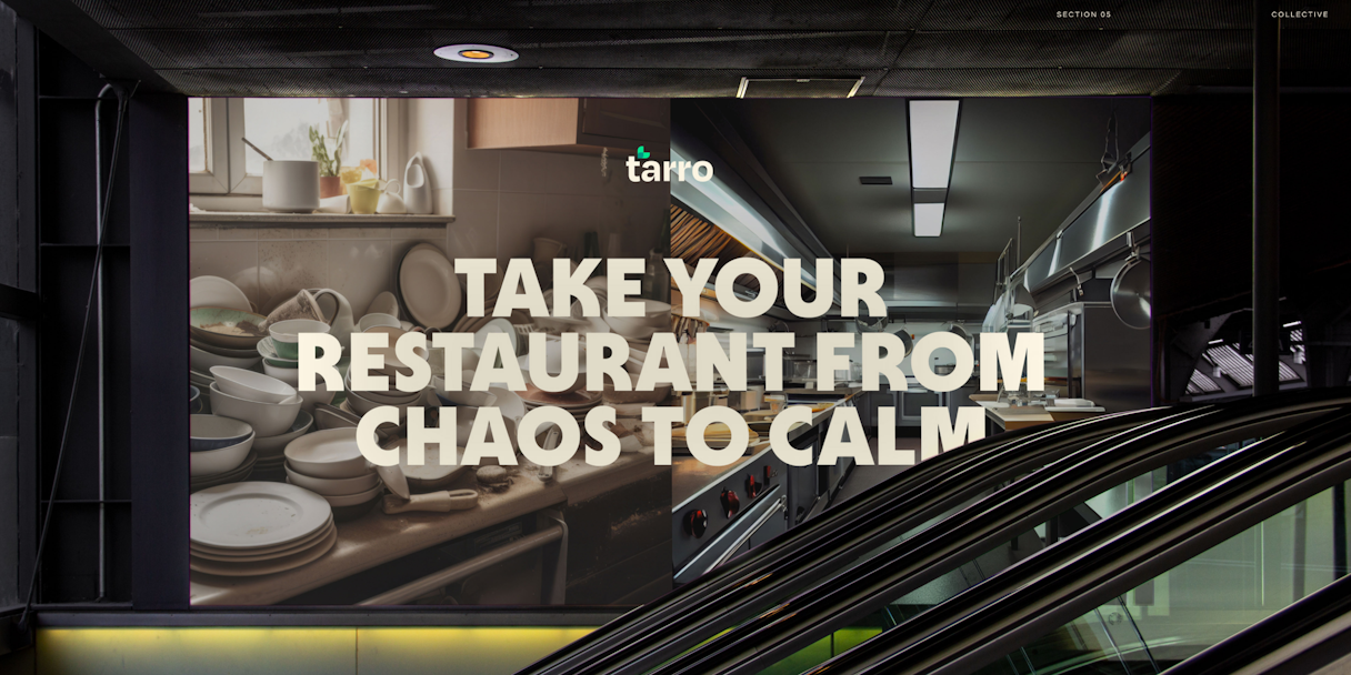
Tarro has a powerful story to tell, so we leveraged a strategy of expressing that narrative through a combination of image and typography. Through diptychs, marketing can highlight the contrast between “the bad” and “the good,” or a before-and-after with Tarro.
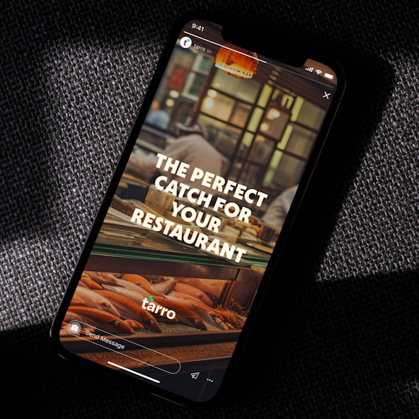
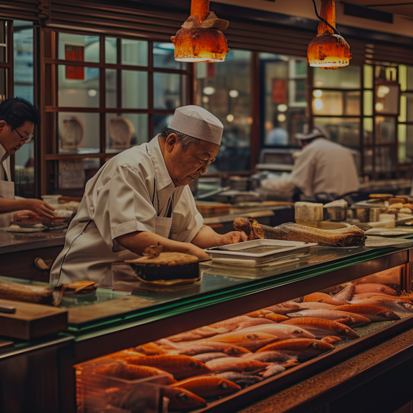
And since restaurants are where Tarro’s clients will literally experience the benefits of the brand and its products, it’s important to highlight those environments.