Illoominus
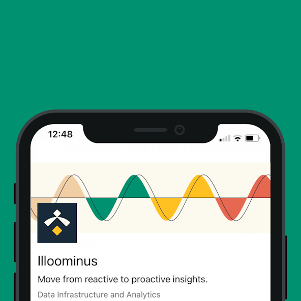
Illoominus is the turnkey people insights platform that integrates and gives context on HR data within and across companies.
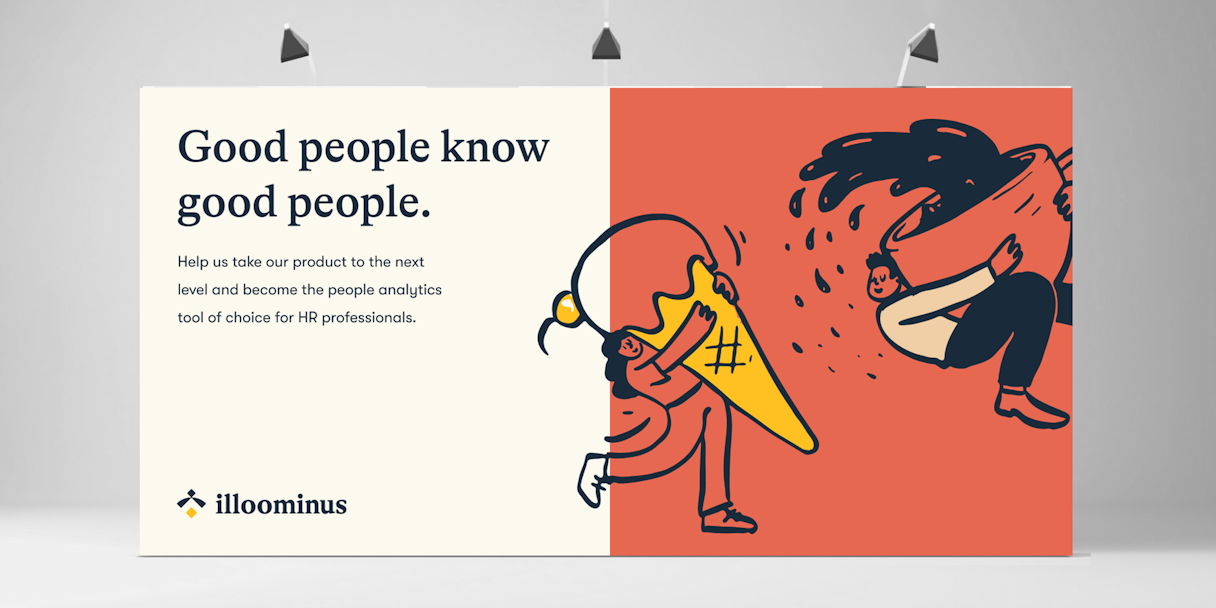
Illoominus empowers people leaders to confidently invest in data-driven strategies that transform organizations into people-first workplaces and with such an important mission, Illoominus needed a brand that booms.
Baseline Evaluation
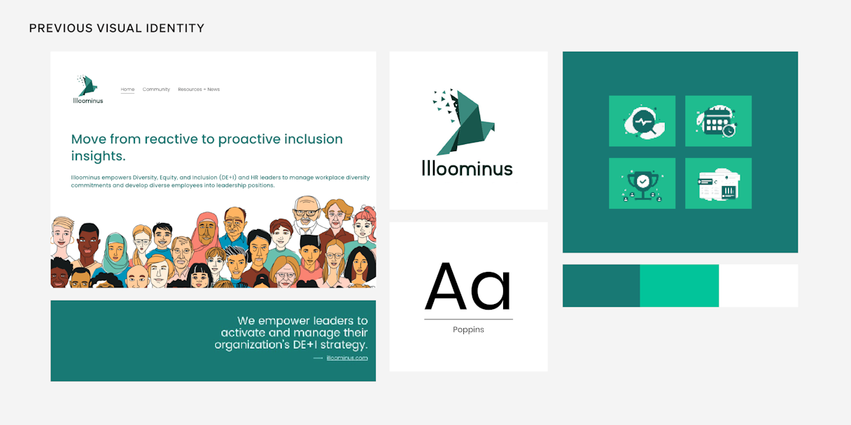
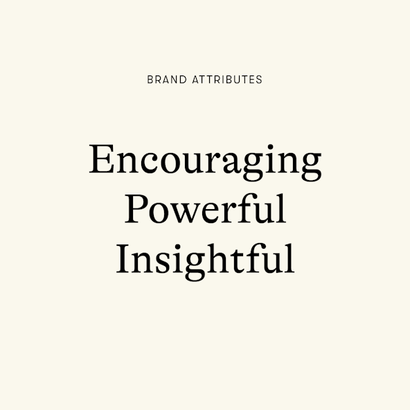
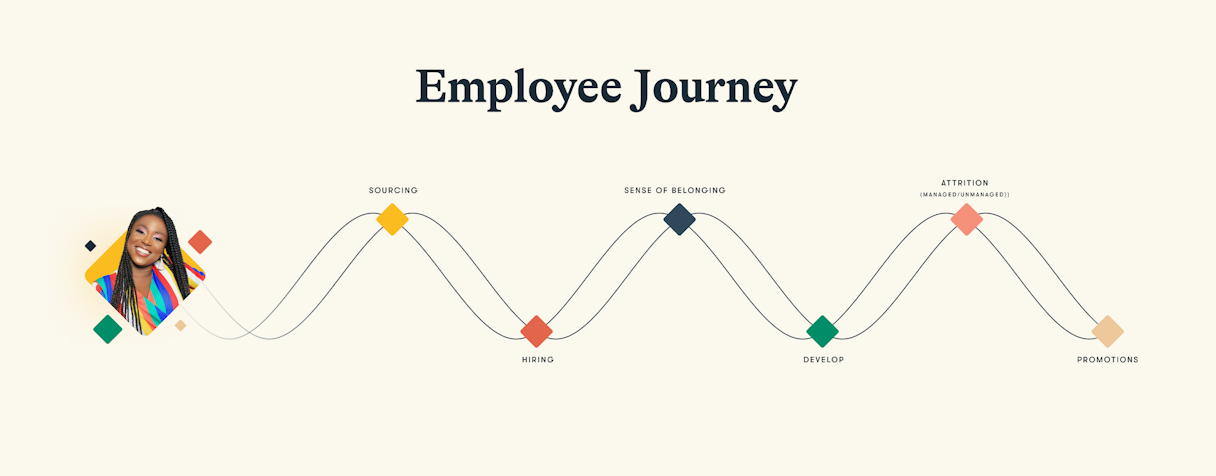
Illoominus’ previous visual identity did not portray the gravity of what they’re accomplishing: equipping leaders to understand the employee journey — across sourcing, hiring, engagement, promotions, and retention — and best address their organizations’ most pressing challenges. Appropriately, Illoominus identified their brand attributes as Encouraging, Powerful, and Insightful.
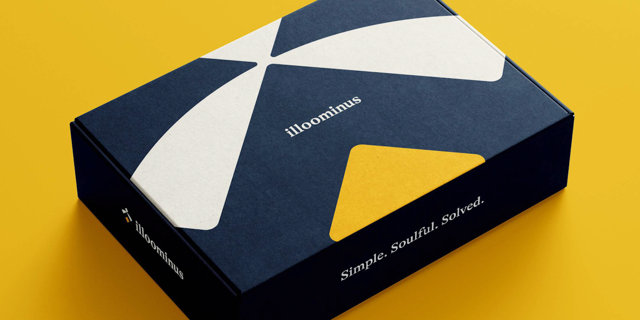
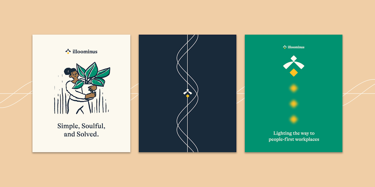
After an audience and competitor analysis, it was time to develop a visual strategy to help the brand stand out in the HR tech market. We created mood boards based on Illoominus’ brand attributes. The Illoominus team agreed on a direction, culminating in identifying the Single Most Important Thing to get right in their visual identity: Simple. Soulful. Solved.

First Round of Ideation
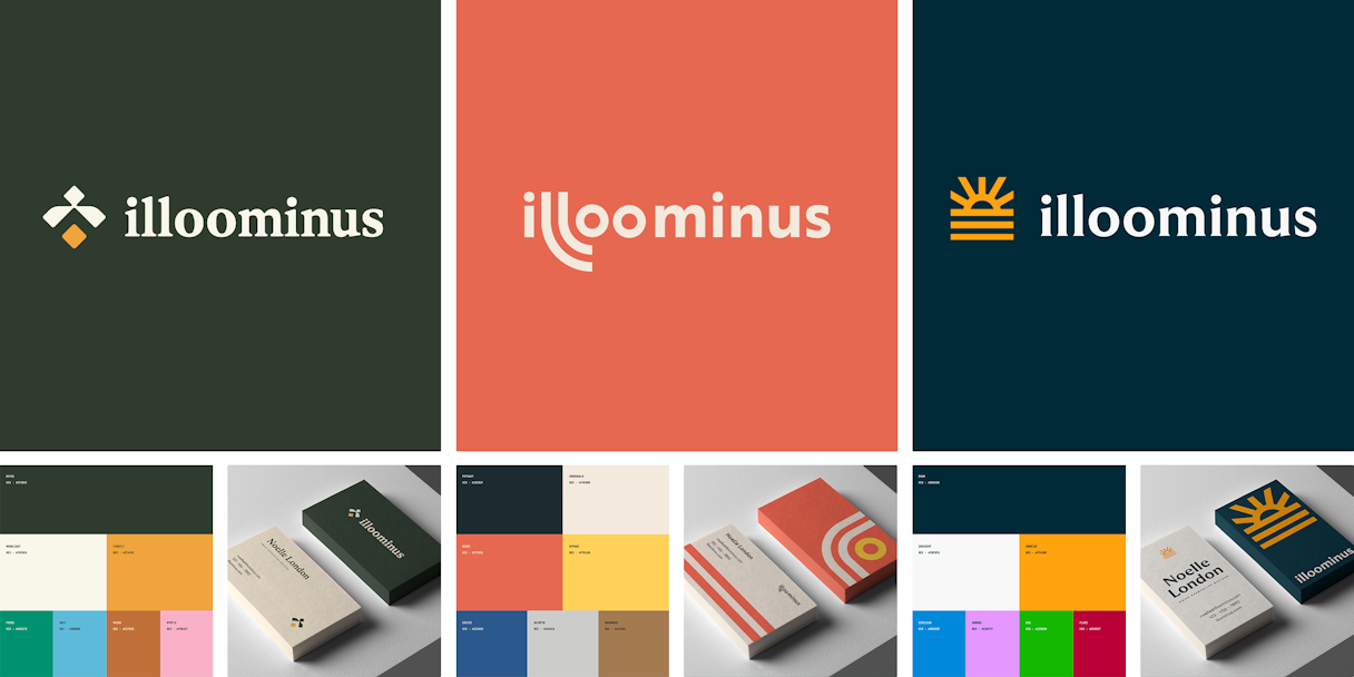
Our first round of ideation began with a few visual concepts: “Lampyris,” “Thoroughfare,” and “Daybreak.”
Inspired by fireflies lighting the night sky and illuminating a path forward, “Lampyris” represented the role that Illoominus plays in the HR tech landscape. The design in “Thoroughfare” was inspired by winding roads, symbolizing a business’ journey to success with Illoominous to guide them. Finally, “Daybreak” was the most on-the-nose concept, represented by a sunrise-inspired mark.
The Refinement Process
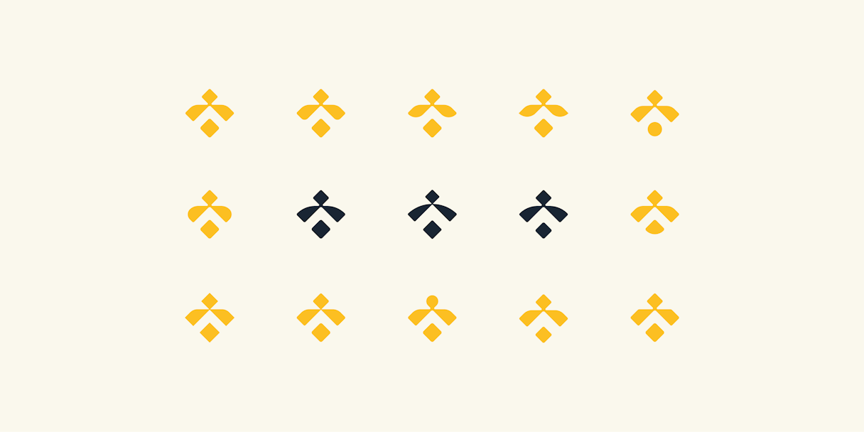
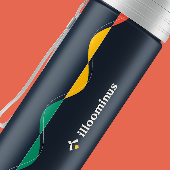
Of the presented concepts, “Lampyris” won out. However, the Illoominus team resonated with the storytelling behind the winding visual language element from the “Thoroughfare” concept. We were able to apply elegance and abstraction to the unique winding flight patterns of the firefly, creating a scalable visual language element that still ties closely to the brand’s mission. With this new centralized visual direction, Illoominus was well on its way to its finalized brand.
Brand Style Guidelines
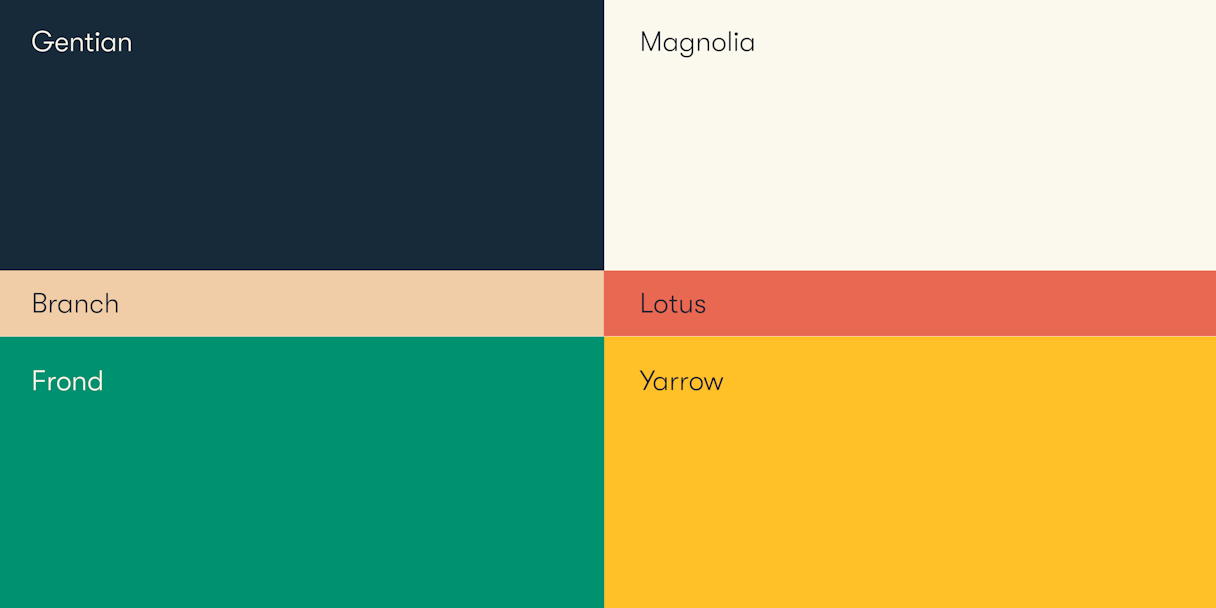
Based on feedback, we shifted the color palette to be grounded in a dusty navy color that we dubbed Gentian, after the blue flower. The color family now had a balance of light and dark, cool and warm, and bright and subdued. This created a well-rounded brand colorscape that feels more representative and inclusive. Each color received a new moniker inspired by flowers and fauna. This was yet another way to highlight Illoominus’ commitment to growth.
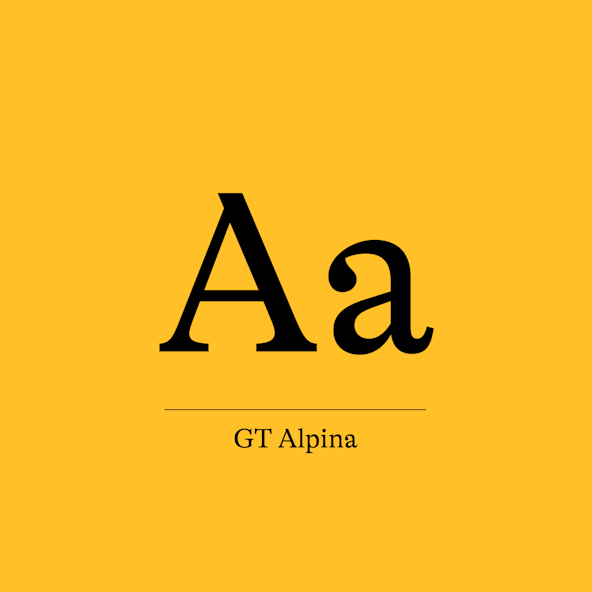
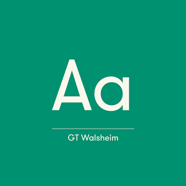
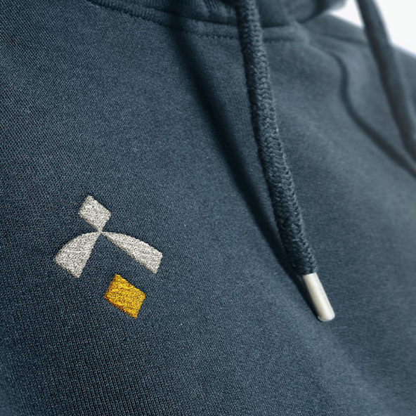
Utilizing GT Alpina as the typeface for the logotype was an easy choice. It has the friendly yet refined air that we were looking for with the Lampyris concept. The logotype felt modern but enduring, fresh but timeless. We also wanted to offset the rectitude of GT Alpina by injecting some casualness into the brand. GT Walsheim is familiar in the tech landscape, but it isn’t overdone. It contains the perfect amount of legibility and precision to act as the brand’s secondary typeface.


Brand Support
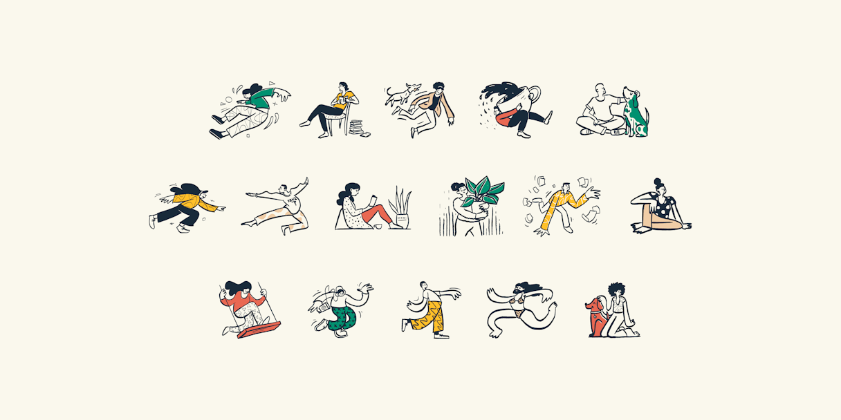
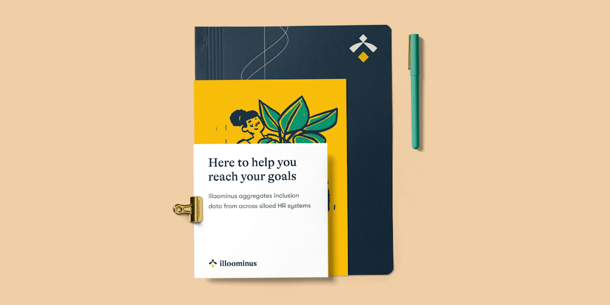
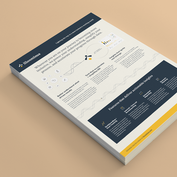
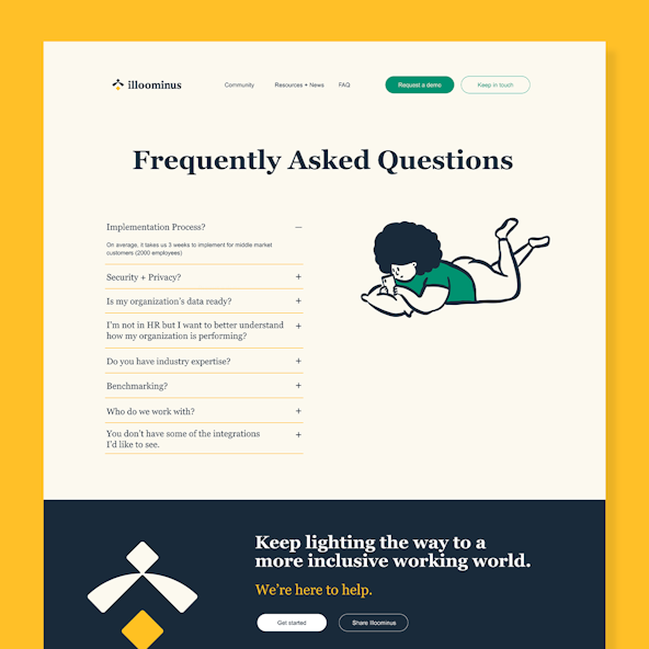
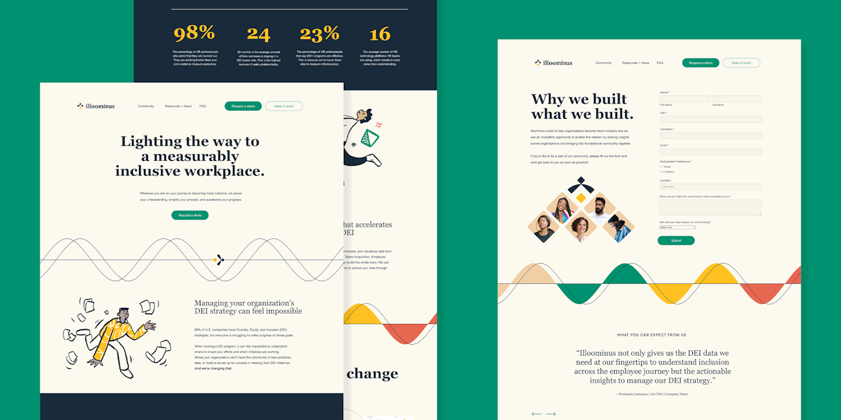
Through our Brand Support offering, we were able to offer Illoominus the assets needed to implement their new brand. We reskinned existing key pages to establish an on-brand visual web experience. We also made a one pager and an illustration for the employee journey.
Working with Odi was a difference-maker for the stage we were at because the team there proactively found ways to help us and were clearly rooting for us to succeed!