Masuga
Since their inception, Masuga have offered customized web development solutions to meet their clients’ most challenging business objectives.
They’ve streamlined and simplified processes for websites and content. Ensured data stored in different platforms can be reliably shared and synced. Shown up as a collaborative partner, deeply knowledgeable and deeply committed to the people they help. Their specialty? Giving the most complex, expensive, and time-consuming problems the tailored solutions they deserve — efficiently.
They’re the ones companies turn to when out-of-the-box offerings don’t cut it.
Masuga hoped to come across as a cohesive entity, appealing not just to new industries, but new talent that might join them in their efforts. Their refreshed purpose and direction would make a strong bid to both.
Baseline Evaluation
Masuga came to Odi with exceptional clarity about who they were and wanted to be. And they were just as clear about what was holding them back. For nearly two decades, they had been focused on technical implementation, doing website builds from supplied direction. Now, they wanted to position themselves as supporting whole projects and championing their clients. They sought to offer a more comprehensive set of services and to be seen as engaged in higher-value efforts like problem solving, strategy, and support. Having primarily served marketing agencies, they had a new target of North American SMBs in the software, entertainment, and hospitality industries, along with startups and entrepreneurs who need online strategies, web design, and development.
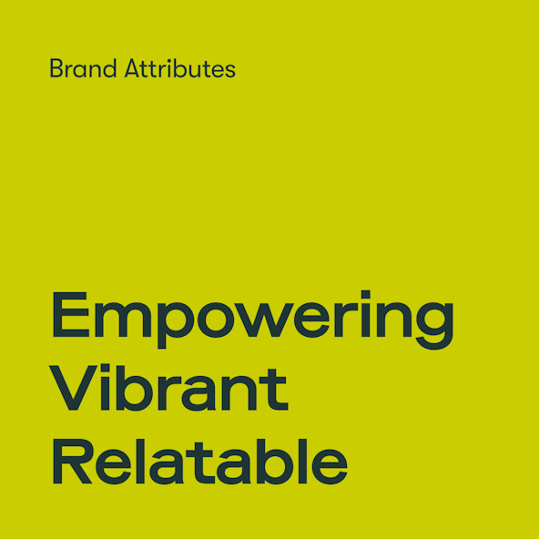
We worked with the Masuga team to settle on Empowering, Vibrant, and Relatable for their brand attributes, which led us to their Single Most Important Thing (aka SMIT): Empowerment in Action. The SMIT acts as our North Star during the project, guiding our decisions and acting as a benchmark to stay focused.
Verbal Identity
Positioning
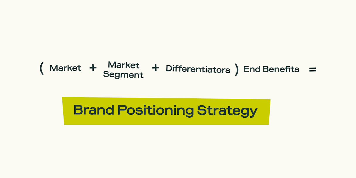
Masuga’s changing focus called for updated positioning. We wanted them to be perceived as solving problems specific to their verticals; less about tools and implementation and more about creating targeted online strategies; and more than web-problem fixers and day savers but attentive, collaborative experts and partners.
To achieve this, we elevated Masuga’s customer-centric differentiator and explored ways of making it feel different. How could we characterize a working relationship with Masuga in a way that set them apart?
We reframed Masuga’s positioning to highlight its new verticals and emphasize a rich customer experience: high-value inputs and interactions. Relatability. And problem solving as an iterative journey, not a sprint.

Situational Messaging
To carry Masuga’s value forward, we crafted a USP and value proposition that capture, in short form, how a Masuga engagement would be experienced.
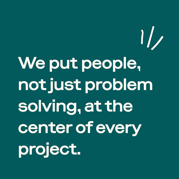
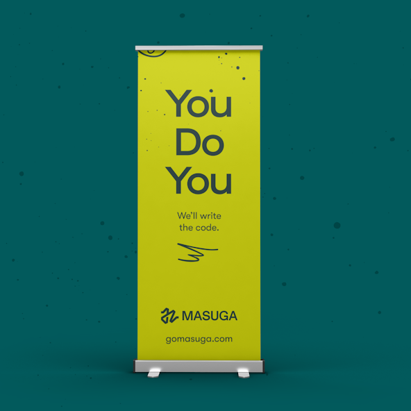
Within the USP, the key phrase became “[to] put people, not just problem solving, at the center of every project.” This reflects all three of Masuga’s brand attributes — relatability, vibrancy, and empowerment — and assures clients that while arriving at targeted solutions together, Masuga ensures they feel seen, heard, and understood in the process.
The USP’s promise is unpacked in the value proposition, which we treated as a short paragraph versus a single statement. In this case, we focused on empowerment, but our voice telegraphs relatability. The value proposition speaks to both future clients and prospective employees, conveying the nature of Masuga’s work in language that feels exciting: “bold and creative,” “cut through complexity,” and “talk like one human to another.”
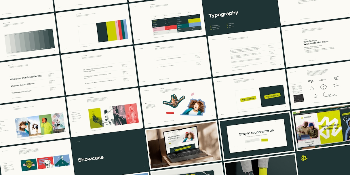
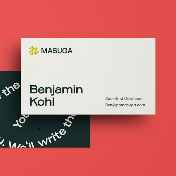
Logo
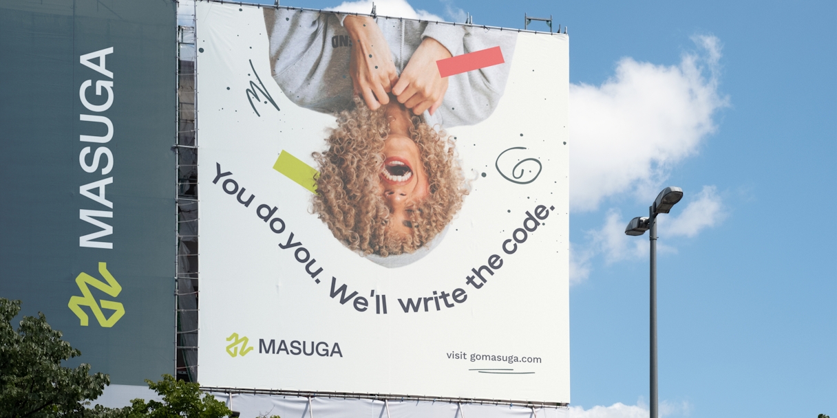
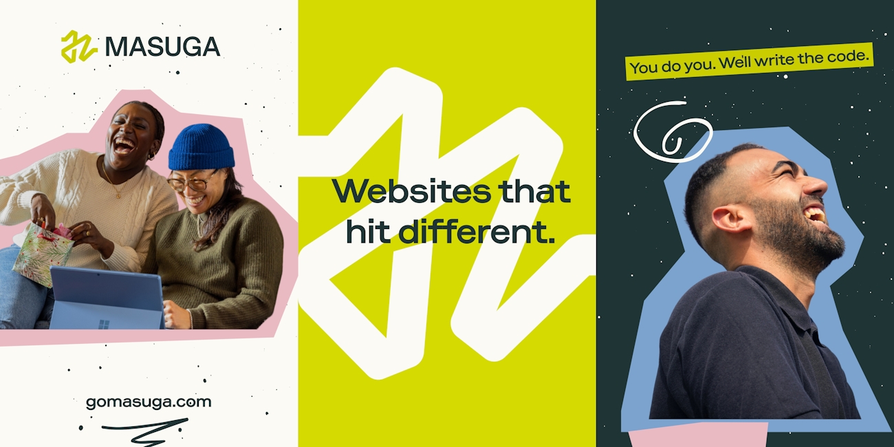
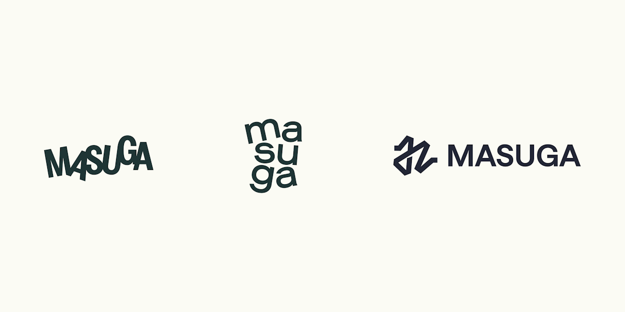
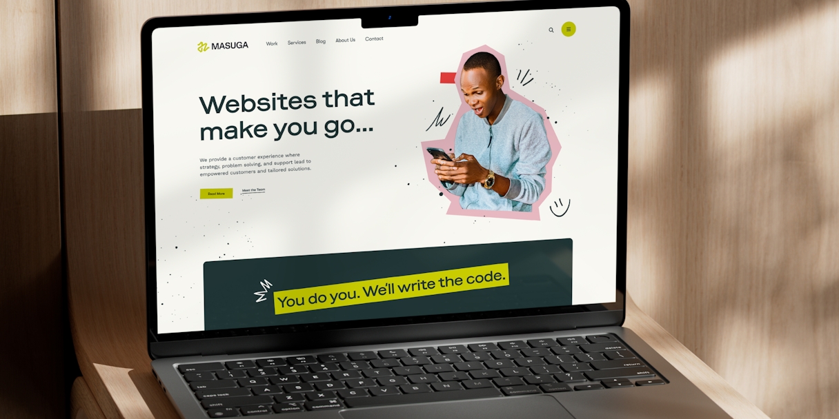
We specifically designed the Masuga logomark to feel spontaneous and flexible. Despite seeming arbitrary, with its energetic, oscillating path, the mark comes together to form a subtle “M” for an added connection to the brand name.
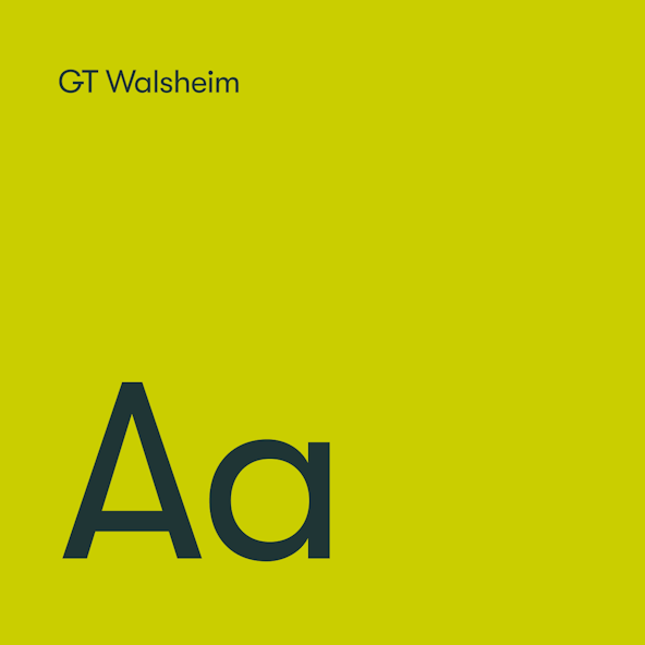
Due to the amount of energy packed into the logomark, we took a more subtle approach to the logotype. A strong, sturdy, geometric sans serif anchors the logo and provides a sense of control that balances the random nature of the mark. We made some slight optical adjustments for greater legibility and rounded key corners of various letterforms to create cohesion with the rounded angles found in the mark.
Visual Language
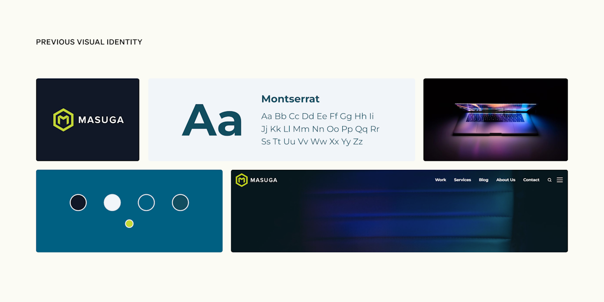
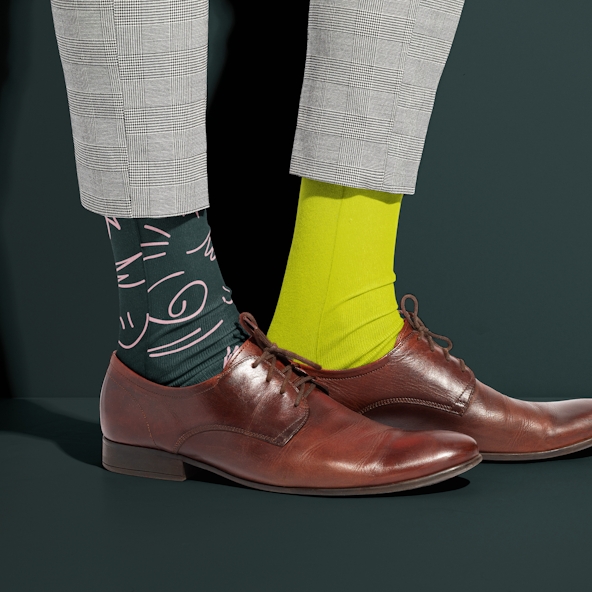
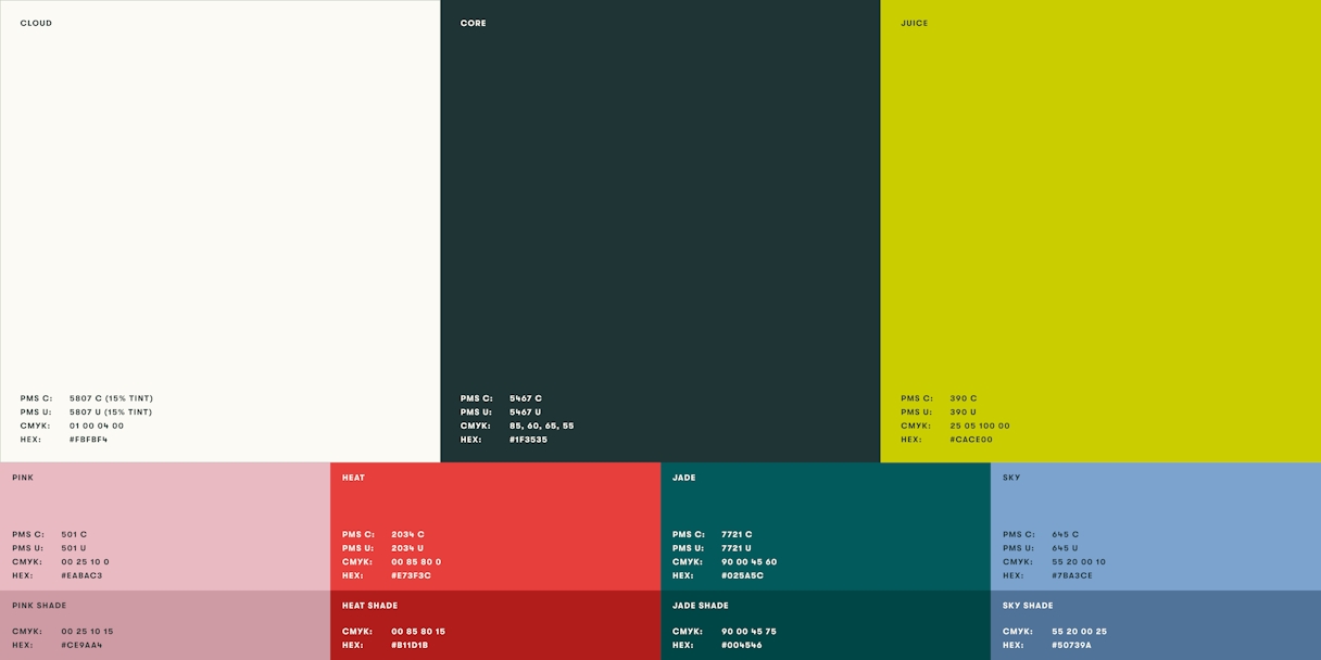
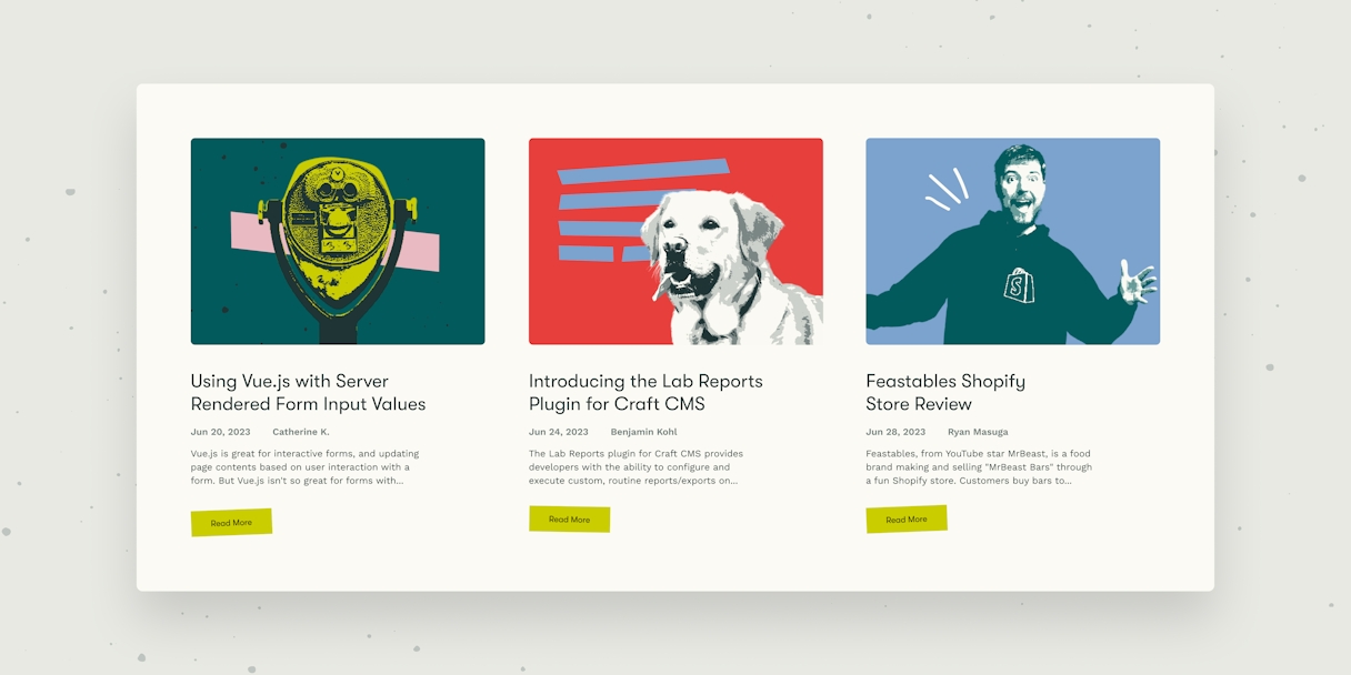
If there was one thing from Masuga’s previous identity we felt could stick around, it was the leading color. “Juice” is an evolution of the lime green of old. We updated it to be legible on light and dark backgrounds and added a bit of yellow for a more peculiar vibe. To balance out the bold primary colors, we created a suite of secondary colors to add depth and provide more relatability.
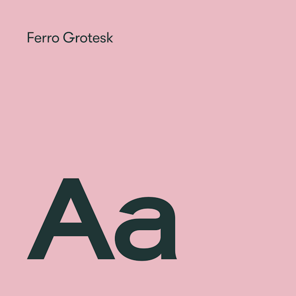
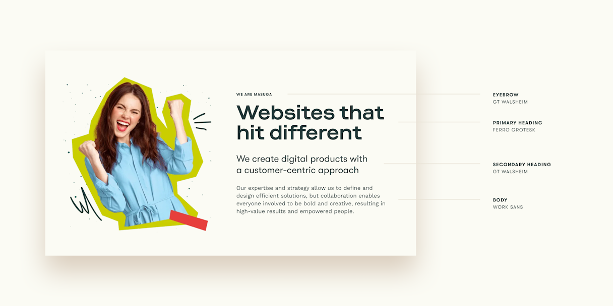
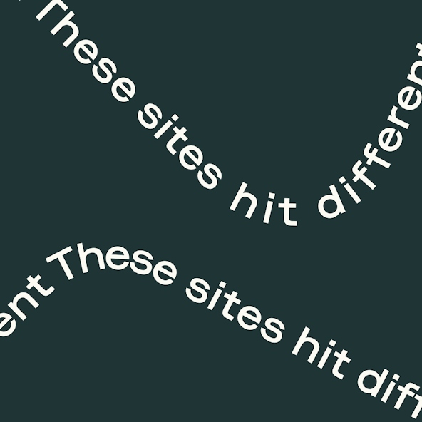
The leading typeface for the Masuga identity, Ferro Grotesk, is a reflection of the offbeat vibes captured in the logo and color systems. Semi-extended, highly geometric, and just a bit weird.
The visual identity system is rounded out with several key graphic elements that may be used separately or in a collage format. A tape graphic element is extremely versatile, as it’s made to be bent and woven as needed, creating interest and branded moments in uncommon ways. A paper-cut style that feels as if it were haphazardly cut out with scissors can be used on photography of people, things, or just as confetti-like adornment. These graphic elements, paired with texture and doodles, hint to the craft behind Masuga’s work. The imperfect, human-centric language brings a vibe to an identity that is nothing short of a damn good time.

You took what could be a scary, intimidating process and made it very smooth...and fun! I would recommend Odi to anyone serious about re-evaluating themselves through a rebrand.