Doppel
Phishing, cybercrime, damage to brand reputation and value, and on and on. Cyber threats abound in our digital world — but Doppel finds them and takes them down.
Across social media, crypto, domains, and app stores, Doppel provides extensive coverage of every digital channel through state-of-the-art AI (high-signal, low-noise reporting) and by tracking enforcements with an auto-generated audit trail.
The company partnered with Odi to develop a differentiated visual identity, one that was professional and sophisticated, and one which aligned with a North American user base — all the while being flexible enough to expand and appeal to multiple target audiences.
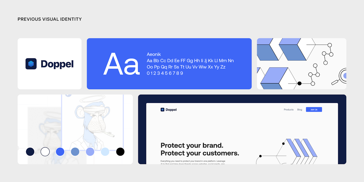
Brand Evaluation
Cyber security is an expansive industry that impacts many people; accordingly, Doppel’s target audiences span everyone from information security professionals to general counsel and directors of brand enforcement to heads of marketing and community.
A unique challenge Doppel faced was its competitive landscape. Oftentimes, a company’s competitors tend to blend in and have a lot of overlap, visually and design-wise, but that wasn’t the case with Doppel’s competition. Still, some patterns emerged. Competing brands tended to use all-caps logotypes and emphasized wordmark-only lockups. And while they had varying color palettes, they tended to employ non-premium fonts and a slew of sans serifs.
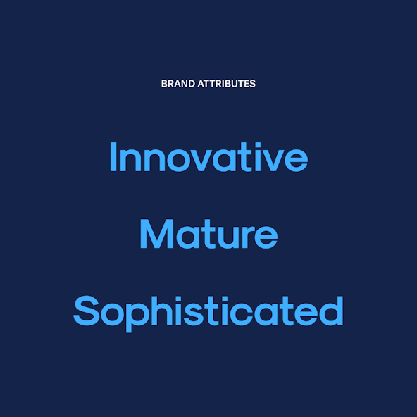
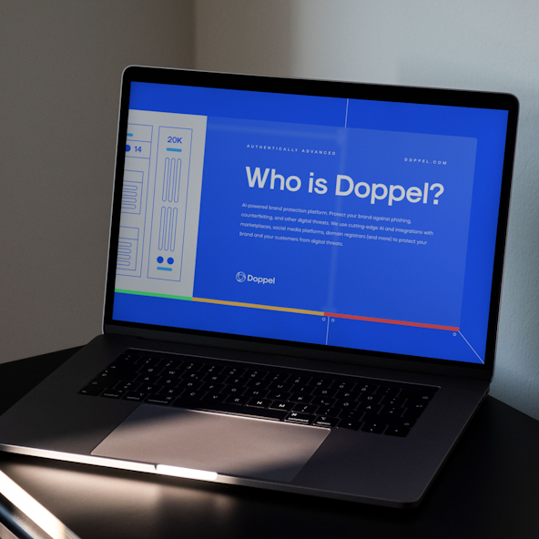
To create a stronger base for differentiation, the Doppel team identified three brand attributes: Innovative, Mature, and Sophisticated. From there, collaborating with Odi, the project team arrived at its Single Most Important Thing (SMIT) — the theme that would guide the brand’s development and serve as the cornerstone for its distinction. Doppel’s SMIT: Authentically Advanced — a vibe that instantly communicated innovation and capability, and paired those qualities with a genuine desire to protect our digital world.
Logo
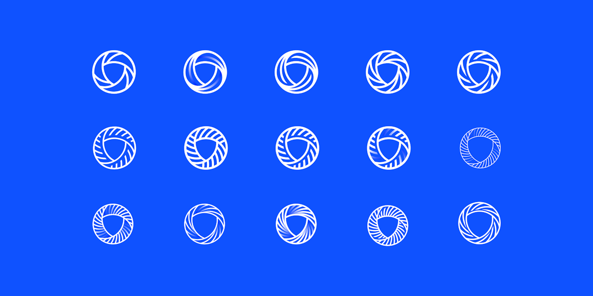
In the spirit of protection, Doppel’s logomark is named The Warden. Circular in nature, with lines that evince dynamism and the intersecting swirl of protection capabilities and technologies, the mark features a shield at its heart.
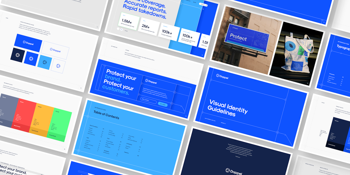
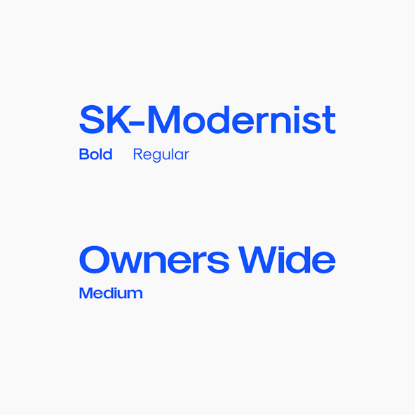
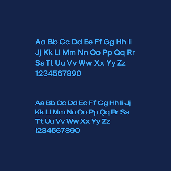
The logotype is set in SK-Modernist font and uses title casing; the lockup consists of The Warden accompanied by the logotype to its right. The font, with its mix of strong letterforms and curves, conveys consistency, authority and security.
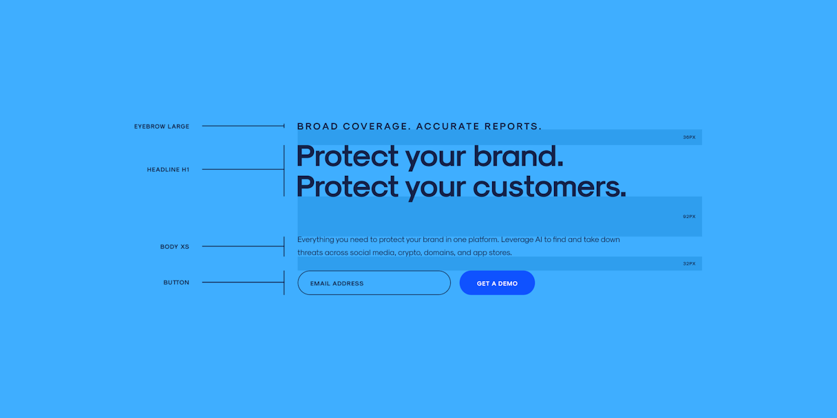
SK-Modernist serves as Doppel’s primary typeface. Simple and legible, the font is a workhorse. To add more notes of strength, Owners Wide — a wide set sans serif — accents secondary headlines. The combined effect of the fonts feels both tech-forward and trustworthy.

Visual Language
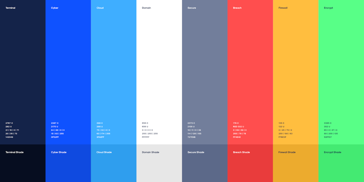
A monochromatic blue primary palette — featuring custom-named colors such as Terminal, Cyber, and Cloud — was a surprising option, as none of Doppel’s competitors had leaned into the sense of security such a palette expresses. A secondary palette that featured bold and vibrant colors added pop and punch — the perfect accents to highlight Doppel’s dynamic protection capabilities.
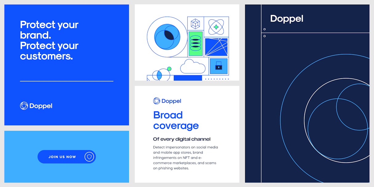
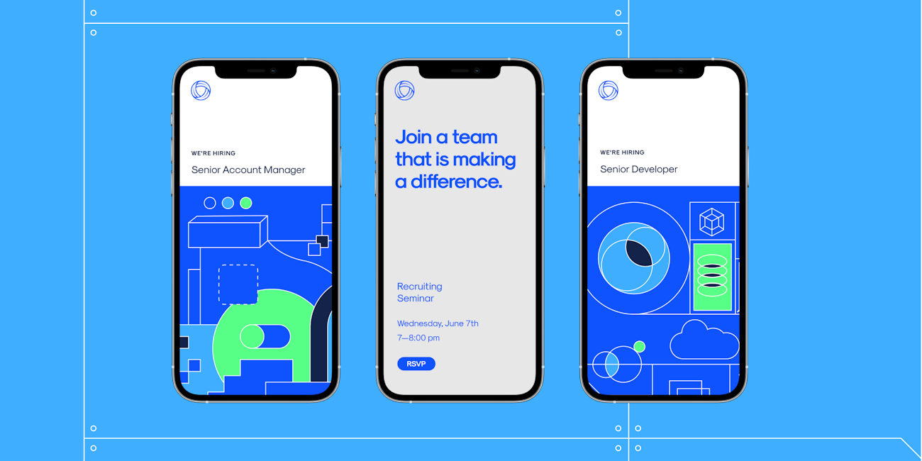
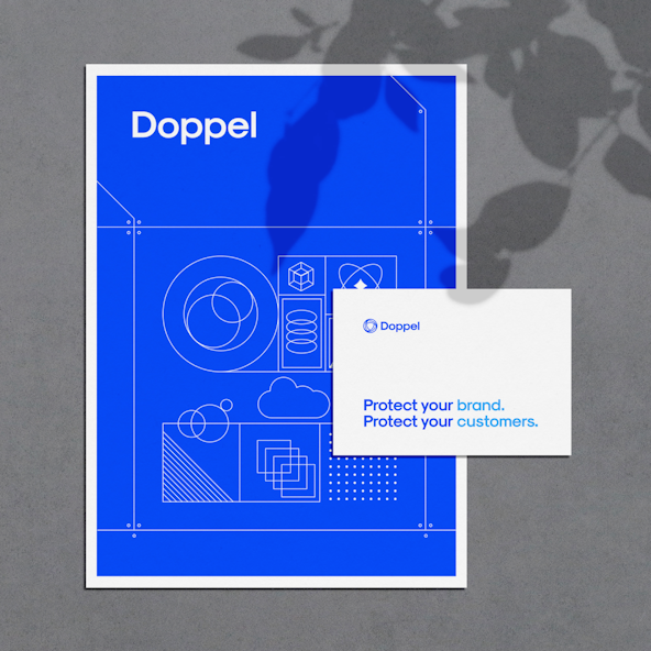
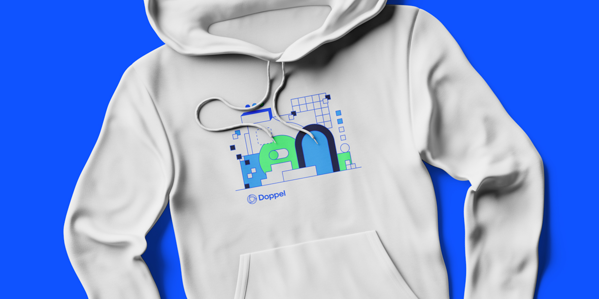
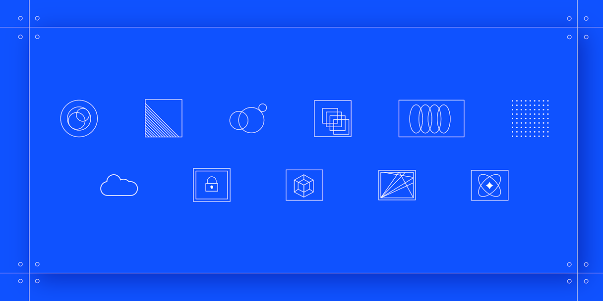
Illustration serves as the brand’s primary visual language element, with a style that uses simple lines and shapes pieced together in college-style compositions. It’s a compelling and flexible way to tell a story.
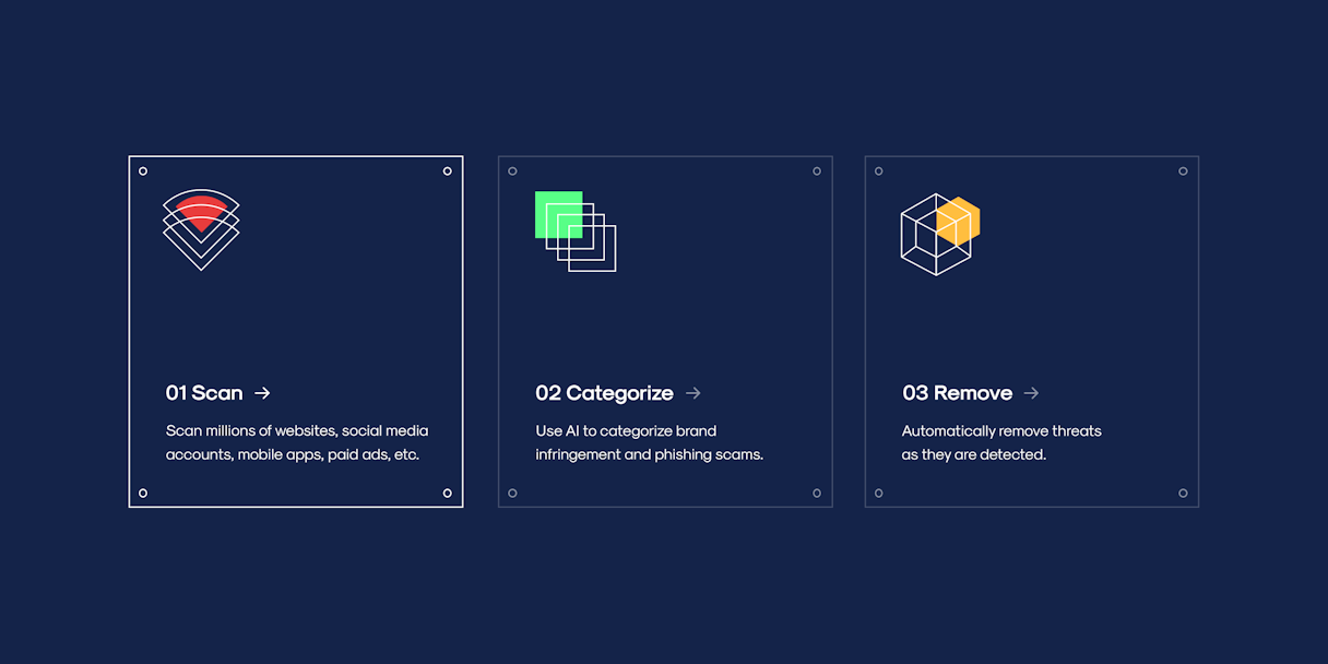
Also flexible is Doppel’s pattern work, a grid-based system that uses lines to create armored plating and circles to make rivets and fasteners — literally protective elements that evoke Doppel’s ability to safeguard its clients’ brands.

Brand Support
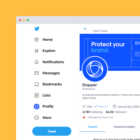
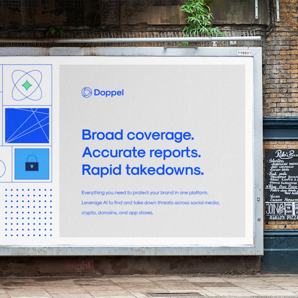
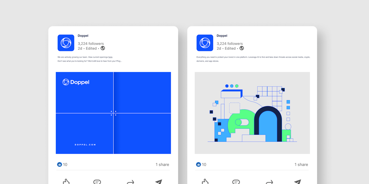
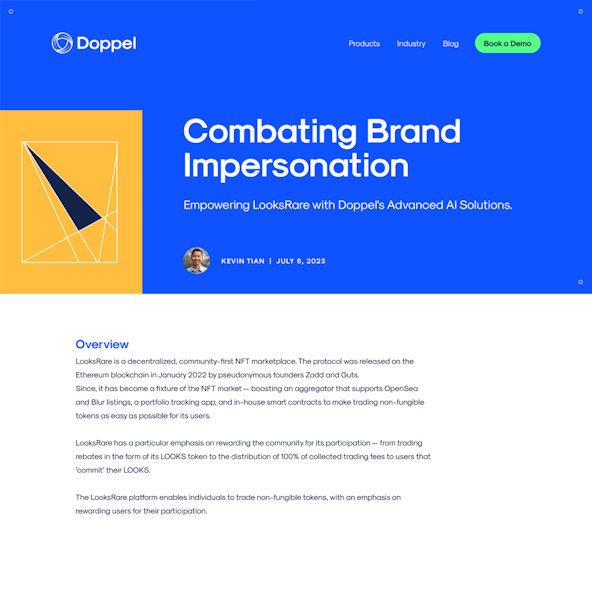
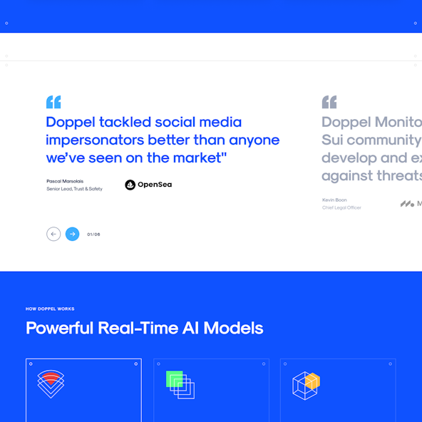
What’s more exciting than building a brand? Watching it come alive on your website. Doppel enlisted the help of Odi’s Brand Support team to do just that. From homepage schemes to blog posts, from industry and product pages to competitor comparisons, Doppel’s new brand took shape — and it was ready to take on any and all challengers.
It was a pleasure working with the Odi team, and the rebrand was critical for helping us share our broader vision to protect public and private organizations from cybercrime and IP theft.
