Formance
Formance builds and operates companies’ payment solutions through their Open Source Financial Core approach.
We worked with the team at Formance to build an identity that conveyed the breadth of their vision and clients. Formance offers a comprehensive infrastructure solution designed to address the limitations facing payments engineers, heads of payments, and payments product managers. With advanced capabilities to express sophisticated flows of funds, Formance empowers businesses to innovate and stay ahead.
Formance offers enormous value to its audiences, and it needed a new identity to better communicate that value.
Brand Evaluation
Formance’s brand attributes were identified as Expert, Daring, and Approachable, which explain how the brand navigates the intricate details of payments, explores uncharted payment territories, and champions efforts to make a traditionally exclusive industry more accessible and transparent.
From there, we identified Sophisticated Flexibility as the Single Most Important Thing (aka SMIT) for the Formance brand. Formance tackles complex challenges head-on, enabling innovative and tailored solutions to dynamic payment needs.


Logo
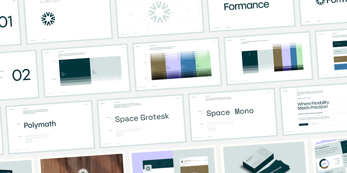
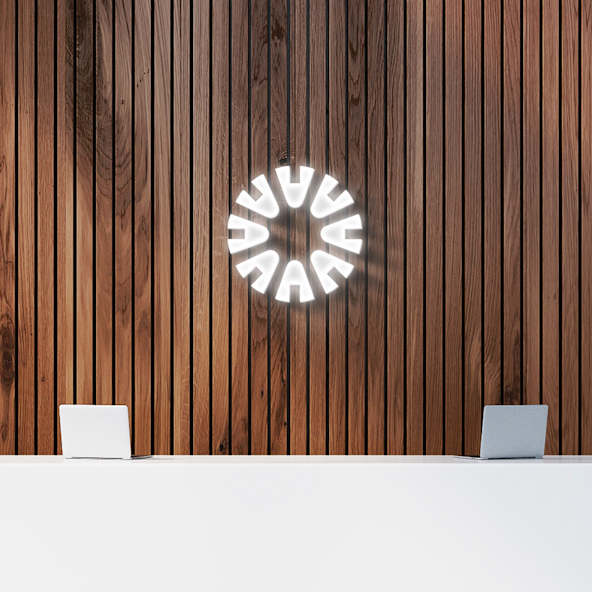
Building on the attributes of the Formance brand, the mark, named “Connector,” serves as the central hub for financial infrastructure. Crafted with a fluid motion, the circular shape expresses an approachable energy coupled with technical empowerment, all while remaining inclusive and accessible.
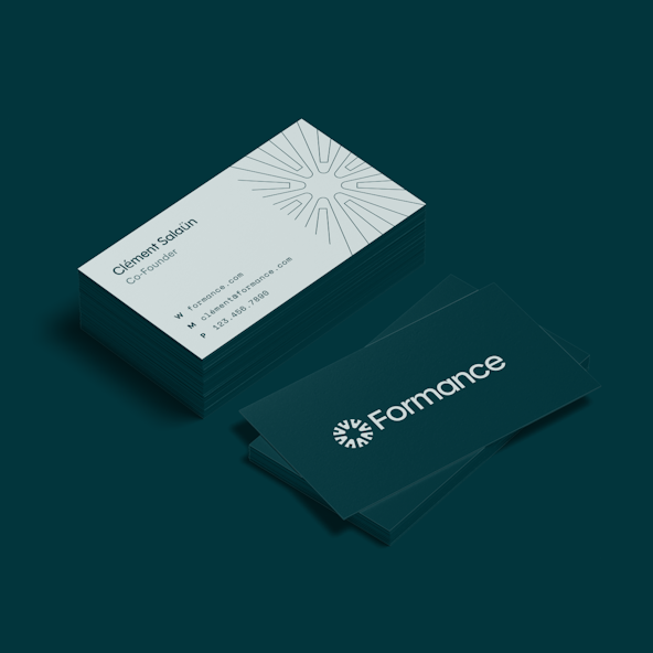
The logotype is the typeface Polymath, which harmonizes geometric precision with contemporary stroke widths that mirror the intricate details of the logomark. It exudes confidence, amplified by its high x‑height, giving the brand a commanding presence.
When locked up, the logo really comes into its own through a simultaneously classic and futuristic feel. The logotype is simple, expert, and approachable, while the logomark is forward-thinking, daring, and intricate.

Visual Language
At the core of our branding strategy is a dynamic typographic system. OhNo’s Polymath typeface carries over from the logotype, conveying a sense of forward-thinking while remaining highly legible, ensuring that headlines command attention and communicate the message effectively. Space Mono brings a sense of technicality and modernity, which is perfect for buttons and callouts where precision and clarity are paramount.
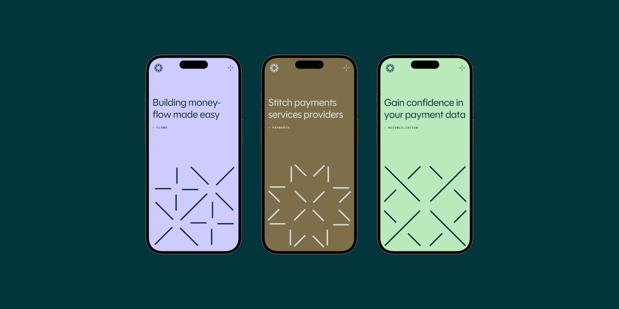
The visual language integrates the connector concept across all facets of the brand. It’s not only adaptable but also scalable, facilitating further graphic representation and an array of shapes to articulate the customization, infrastructure, and interconnected payment solutions Formance offers.
The primary color palette embodies simplicity, modernity, and a touch of luxury. Emerald and Slate form the bedrock of the identity, capable of taking the lead when the spotlight calls. Gold, Lilac, Cobalt, and Mint round out the secondary palette, adding depth and balance.
Shades seamlessly blend all colors into a cohesive whole. From establishing type hierarchy to supporting UI elements and backgrounds, these versatile neutrals play a pivotal role in maintaining visual balance and clarity.


Interactive
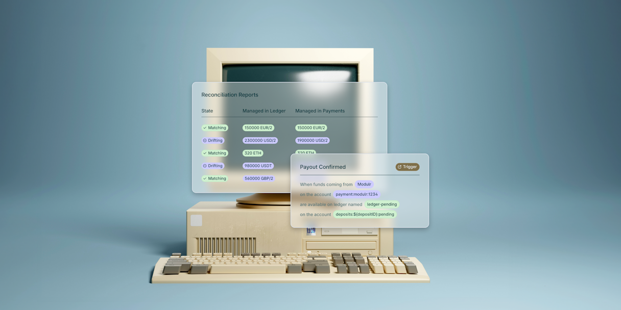
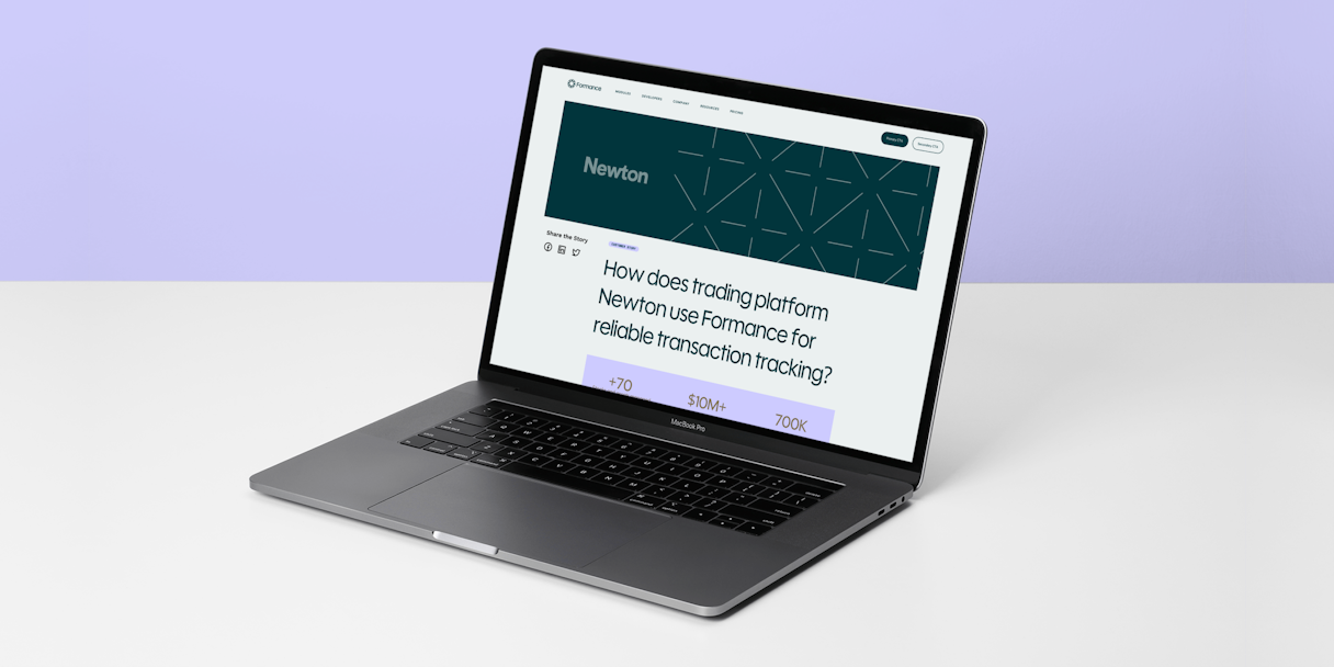
We had the opportunity to bring the whole system to life in reimagining Formance’s homepage to reflect specific aspects of the new brand. For instance, the connector elements illustrate the modularity of the Formance platform, and the color palette exudes sophistication and calm.
A dash pattern adds texture that enhances the overall narrative, visually conveying the brand’s adaptability and technological prowess while adding subtle motion to the homepage experience.