Glyphic
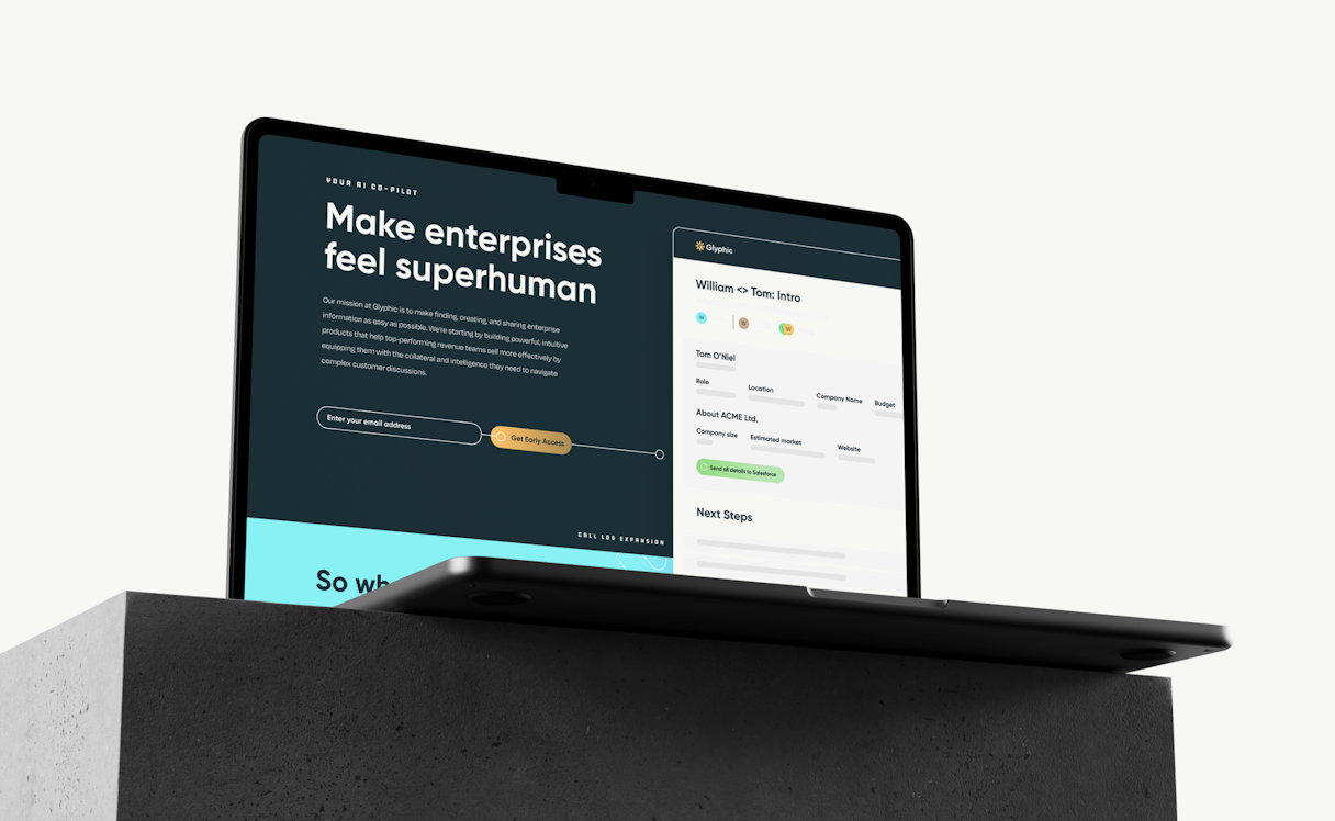
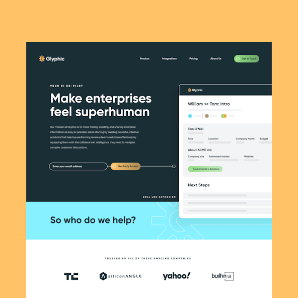
Glyphic’s AI-based assistant supports sales associates in every customer interaction and helps sales leaders make the right decisions thanks to unparalleled visibility into the whole sales pipeline.
As former researchers and operators at top AI research labs and companies, the team at Glyphic was acutely aware of recent transformational changes in the world of deep learning, and they were poised for its next phase of growth.
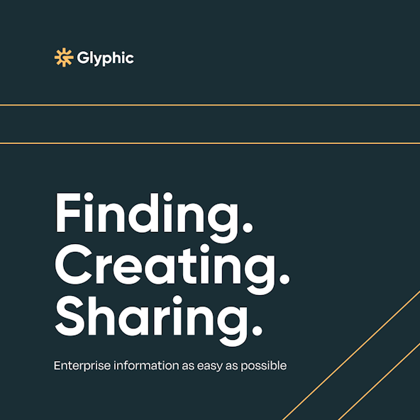
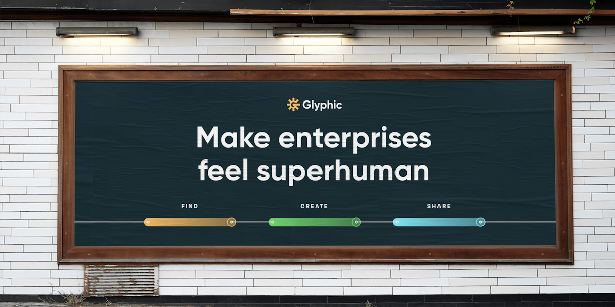
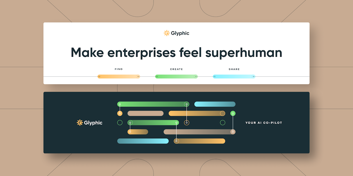
Glyphic is on a mission to build an AI copilot that assists sales teams in analyzing customer interactions and providing strategic insights into sales pipelines.
Baseline Evaluation
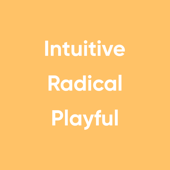
The team at Glyphic identified their attributes as Intuitive, Radical, and Playful. Anticipating responses like an actual personal assistant, their AI has the power to revolutionize the entire sales space. The Glyphic brand needed to be spirited and lively — they’re changing an industry and that’s something to be excited about!
After a thoughtful evaluation of Glyphic’s past, present, and — most importantly — future, we identified some opportunities for differentiation in their visual identity. The sales and AI space is rife with colorful palettes, generic sans-serifs, and rounded abstract shapes. Paired with their brand attributes, we worked with Glyphic to develop their own visual identity to establish their point of view early in the company’s history.
We identified their Single Most Important Thing (aka SMIT) as “progressive and proven.”
Logo
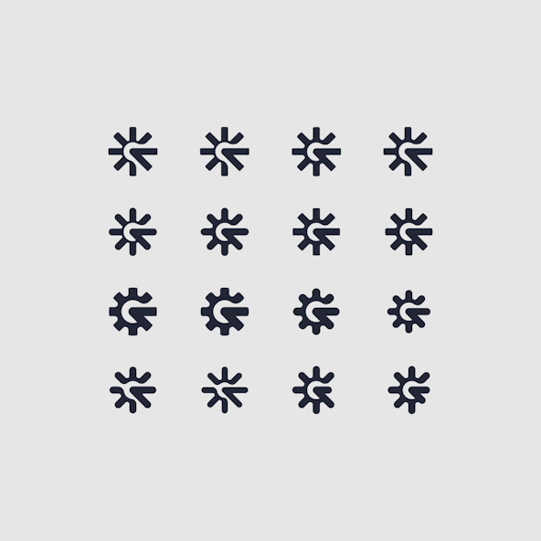
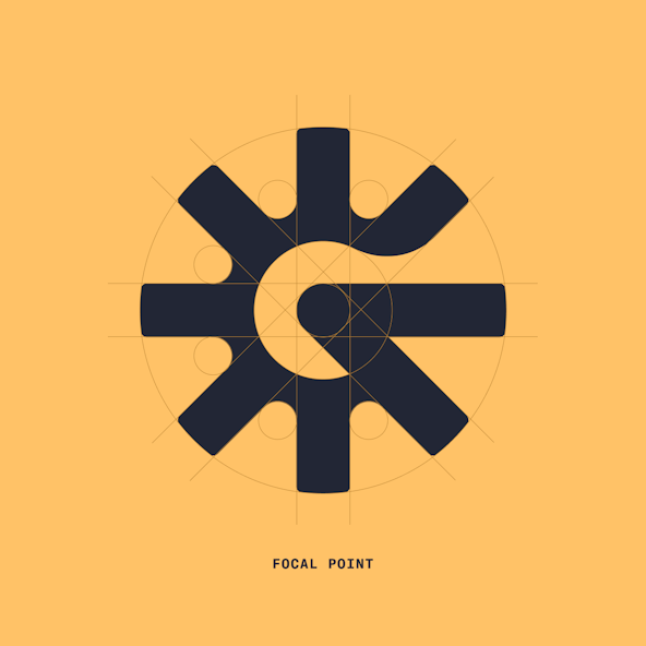
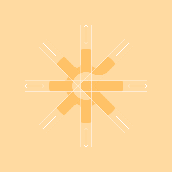
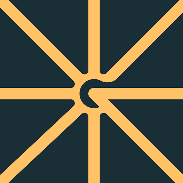
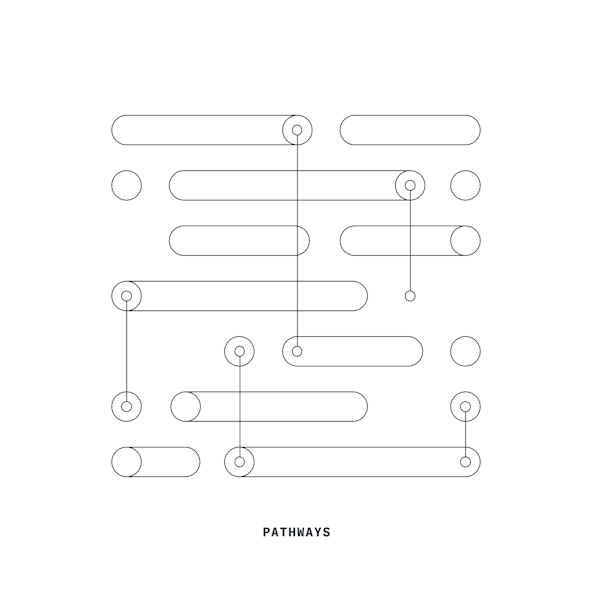
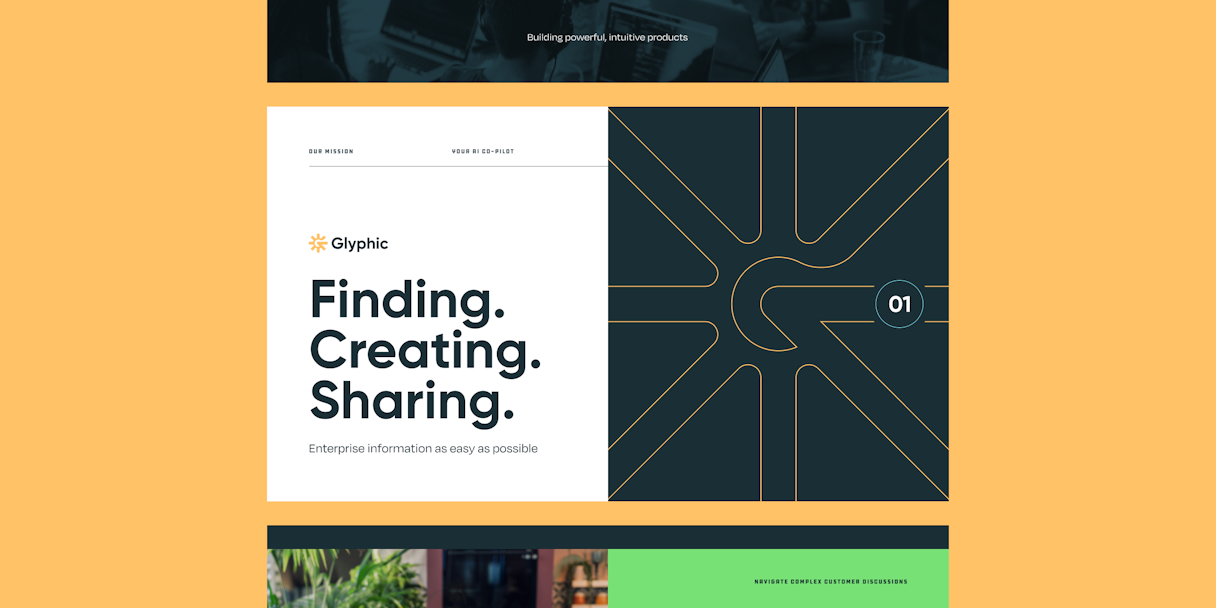
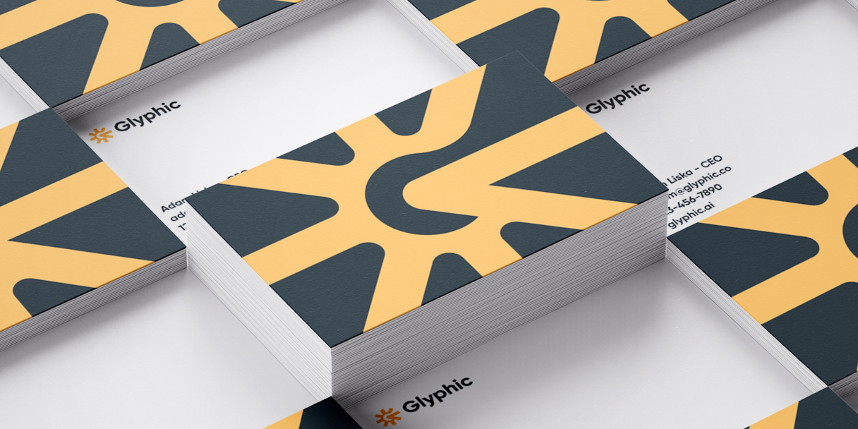
The mark was designed with the idea of a “hub” in mind. Similar to how rail roundhouses are the core for a rail network, we see Glyphic as the axis for enterprise understanding. This mark also plays heavily into the hieroglyphic concept that the product name suggests. We call it The Focal Point.
The logotype is a custom wordmark created to align with the softness and roundness of the mark. Its single weight and smooth paths create a sense of approachability and intuitiveness that we replicated further in the brand.


Visual Language
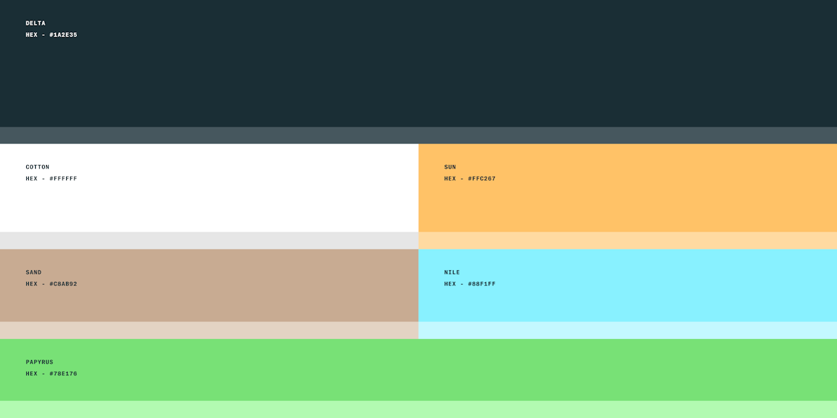
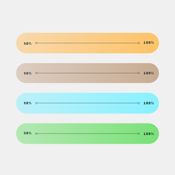
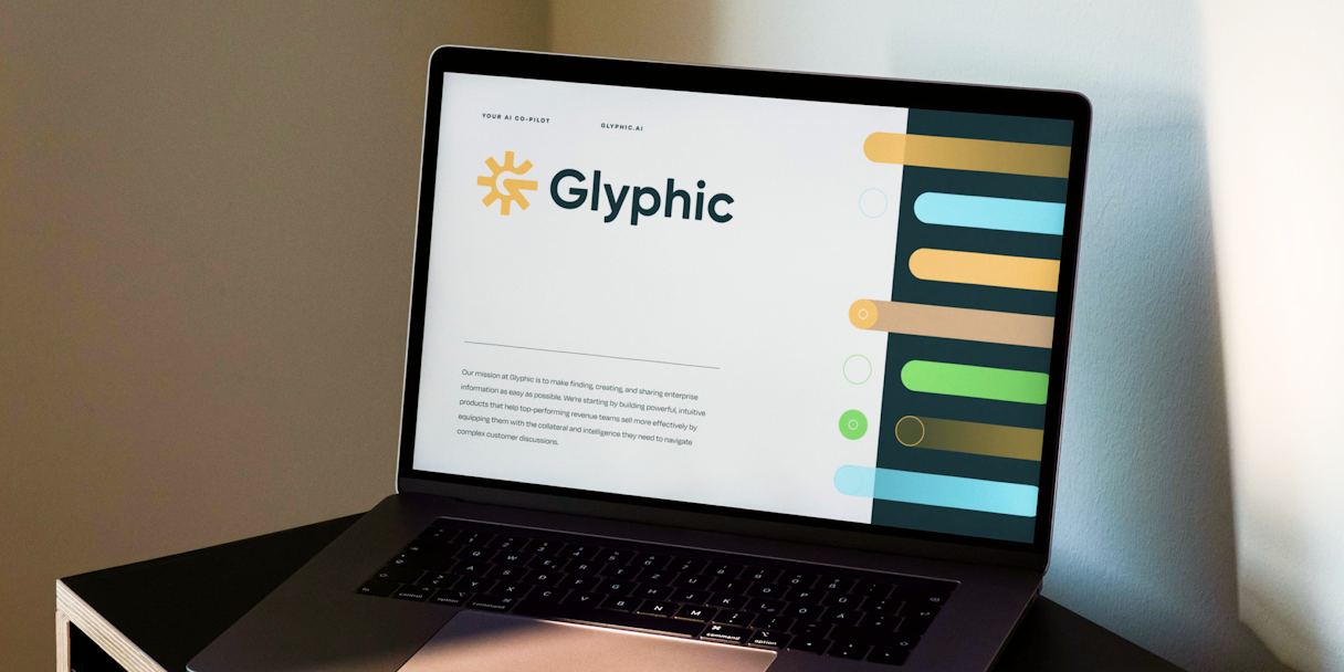
With the dispersion of data in mind, the color palette looks to fill the Glyphic landscape with value. But not over-saturation. The colors feel bright, bold, and friendly, all while having a serious undertone.
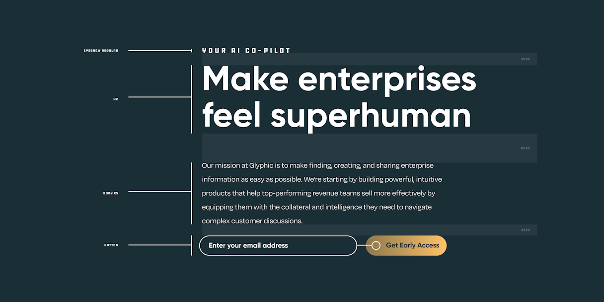
Gilroy is the primary typeface, designed for robust, high-impact use. As the secondary typeface, Degular has all the makings of a workhorse font family while still providing the kind of quirks that bring ownability in a brand typeface.
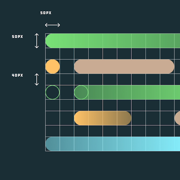
The Focal Point visual language element further comes to life when the individual spokes of the logomark are extended off the bounds of the composition.

Your process, how structured and intentional it was, really allowed us to focus on the project as well as manage the million other things we have going on as a start up.